
![Low-VOC Cabinet Painting Denver: Healthy & Durable Kitchen Refinishing [2026]](https://cabinetsrefinishing.com/wp-content/uploads/2026/08/low-voc-cabinet-painting-denver-healthy-durable-kitchen-refinishing-2026-1344x500.jpg)
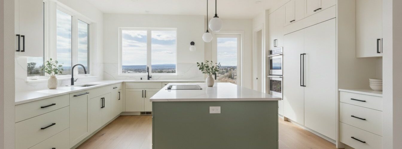

Cabinet color coordination with countertops means selecting colors whose undertones complement each other while occupying the right visual balance across your kitchen. Get this right and the whole room feels intentional. Get it wrong and even expensive materials look mismatched. Understanding how cabinet color coordinates countertops starts with two principles: the 60-30-10 color rule and undertone matching. These are not decorating opinions. They are the same standards professional designers use on every kitchen project, and they apply whether you are choosing white shaker cabinets or bold navy blue ones.
How the 60-30-10 rule guides cabinet and countertop color balance
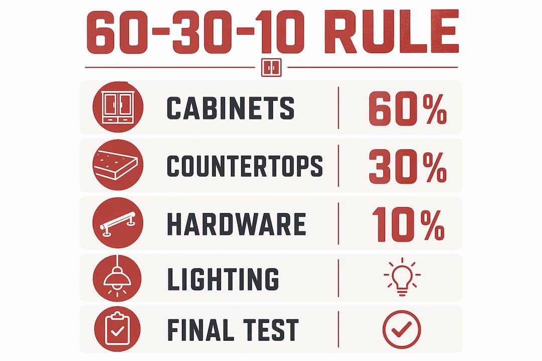
The 60-30-10 rule is the most reliable framework for matching cabinets and countertops. It assigns 60% of the visual space to a dominant color, 30% to a secondary color, and 10% to accents. In a kitchen, that breaks down like this:
- 60% dominant color: your cabinets. Cabinets cover the most surface area in any kitchen. They set the tone for everything else. Choose this color first, because every other decision follows from it.
- 30% secondary color: countertops and backsplash. These surfaces support the cabinet color. They should complement, not compete. A bold countertop pattern works best when the cabinets are a solid, quieter color.
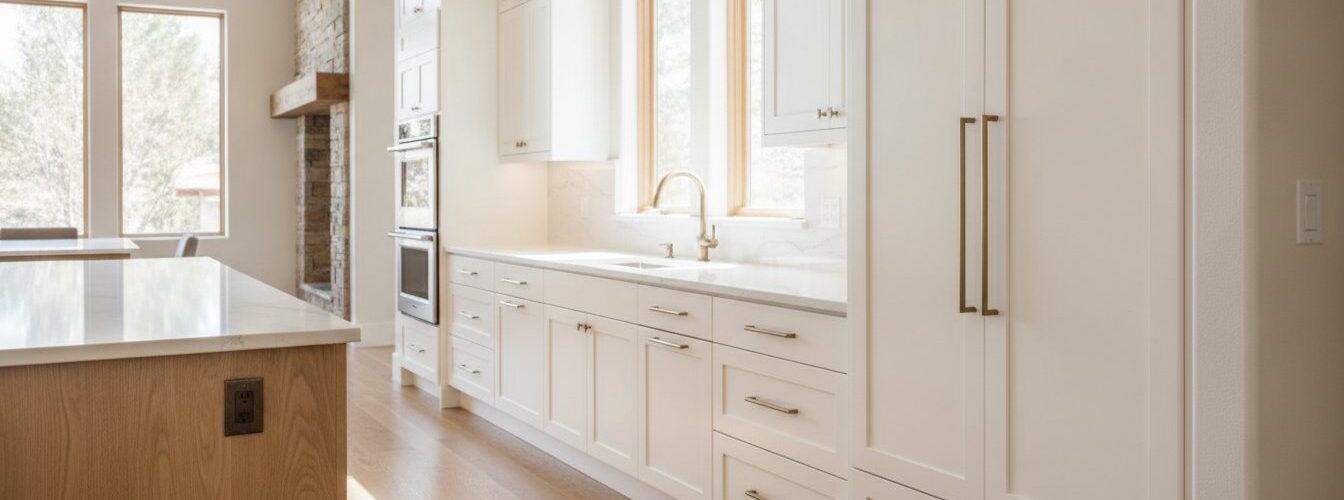
- 10% accent color: hardware, lighting fixtures, and faucets. This is where you introduce contrast or warmth. Brushed brass hardware on white cabinets, for example, adds depth without overwhelming the palette.
Professional designers consistently report better results using fewer cohesive colors rather than many competing shades. That finding matters because most homeowners do the opposite. They pick a countertop they love, then try to find a cabinet color that works with it. The rule says to reverse that sequence. Start with cabinets, then select countertops that support the dominant color you have already committed to.
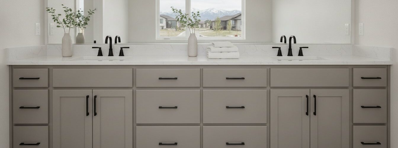
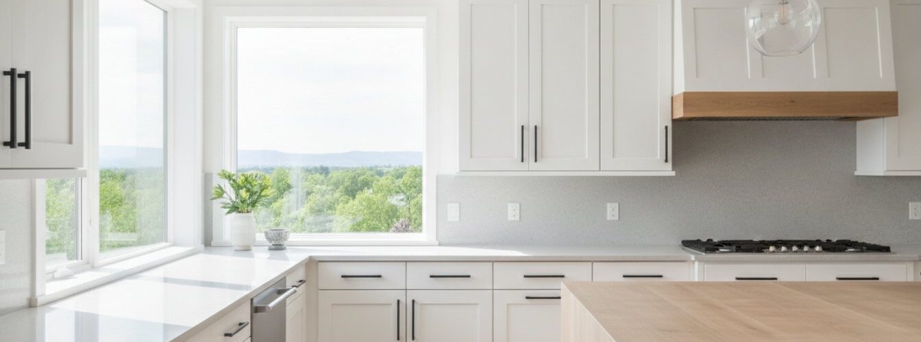
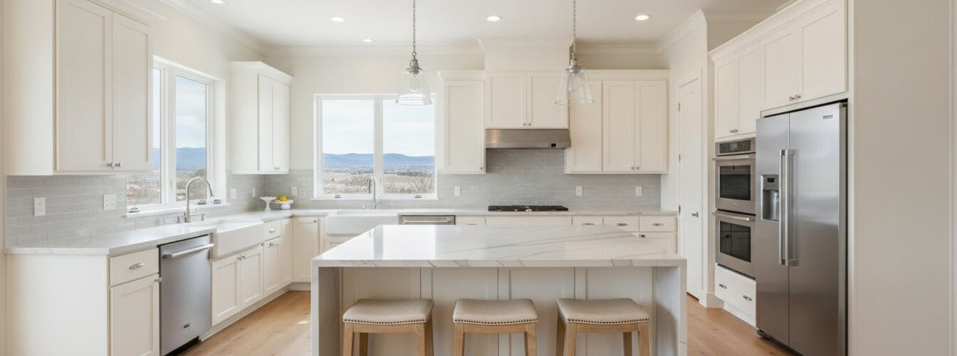
A practical example: soft white cabinets at 60% pair naturally with a Calacatta-style quartz countertop at 30%, then matte black hardware ties the look together at 10%. The result feels curated because each element has a defined role.
Why matching undertones matters more than matching exact colors
Undertones are the secondary hues hiding inside a color. A white paint is never just white. It leans warm (yellow, pink, or red), cool (blue or green), or neutral. The undertone of a cabinet paint color determines how well it coordinates with a countertop, not the surface shade alone. This is the most misunderstood concept in kitchen color selection.
Here is what undertone conflict looks like in practice:
- Warm white cabinets with cool gray countertops. The cabinet reads creamy and inviting. The countertop reads stark and cold. Side by side, neither looks its best.
- Greige cabinets with a blue-gray quartz. The greige has warm brown undertones. The quartz has cool blue ones. The pairing feels unsettled even when both colors are individually attractive.
- Soft green cabinets with warm cream countertops. Sage green with yellow undertones pairs naturally with warm cream or buttery quartz. The shared warmth creates cohesion.
Warm white cabinets can look inviting in one setting and oddly yellow in another, depending entirely on the surrounding materials and light. That is undertone sensitivity in action. The countertop surface amplifies whatever undertone your cabinet carries.
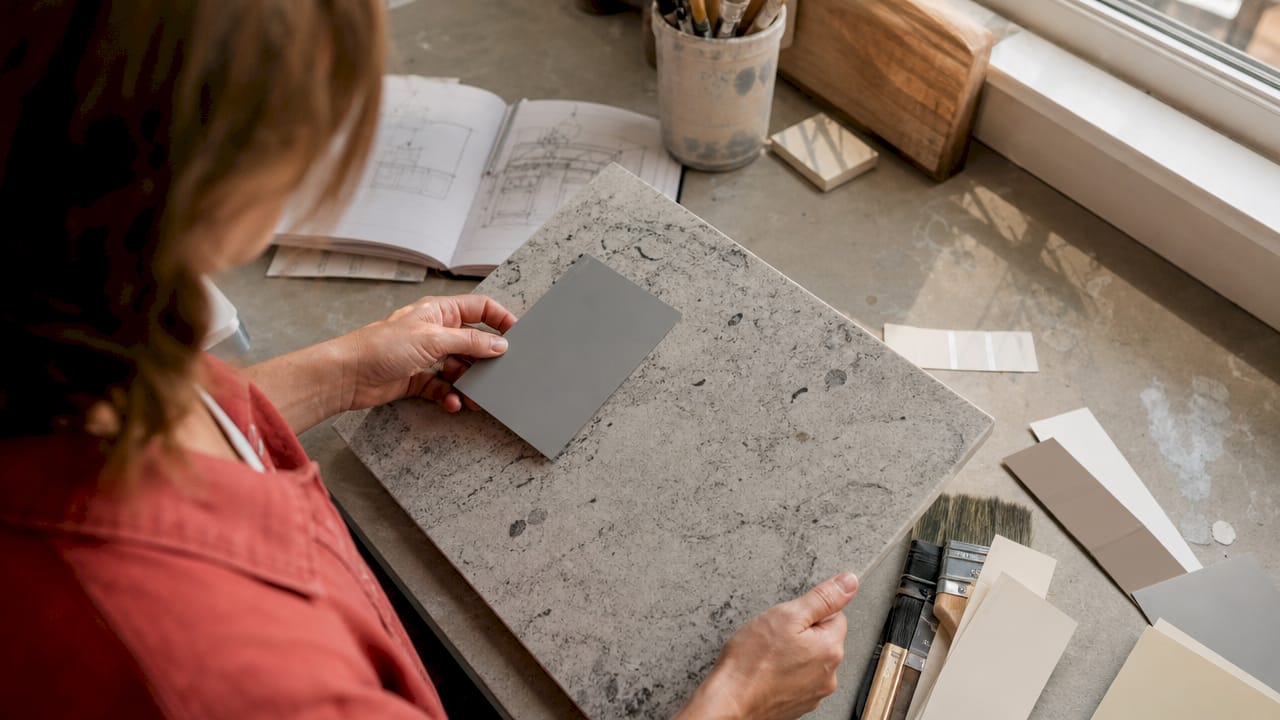
Identifying undertones is straightforward. Hold a paint chip or cabinet door sample next to a pure white sheet of paper. The color that emerges compared to true white reveals the undertone. Do the same with your countertop slab. If both samples pull in the same direction, warm or cool, they will work together. If they pull in opposite directions, you have a conflict to solve.
Pro Tip: Never compare a cabinet color to a countertop sample under store lighting. Fluorescent retail lights flatten undertones and make mismatched pairs look compatible. Always bring samples home.
How lighting changes what you see in your kitchen
Lighting is not a finishing touch in kitchen design. It is an active participant in how every color reads. Lighting conditions significantly alter color perception, which means a cabinet and countertop pairing that looks perfect in a showroom can look completely different once installed.
Natural light changes throughout the day. Morning light in a north-facing kitchen is cool and blue. Afternoon sun in a south-facing kitchen is warm and golden. Both shift how your cabinet color reads against the countertop. A warm greige cabinet can look almost orange at noon in direct sun and look like a clean taupe by evening under recessed LEDs.
Artificial light adds another layer. Warm-toned bulbs (2700K–3000K) intensify yellow and red undertones. Cool-toned bulbs (4000K and above) push colors toward blue and gray. Under-cabinet lighting hits the countertop surface directly, which means it can either harmonize or clash with the cabinet color depending on bulb temperature.
Pro Tip: Test your cabinet color and countertop sample together at three different times: morning, midday, and evening with your kitchen lights on. If the pairing holds up across all three conditions, you have a reliable match.
Digital renderings and tiny paint chips consistently fail to reveal true color interactions. A 2-by-2-inch chip tells you almost nothing about how a color behaves at scale. The only reliable test is a large sample in your actual kitchen.
Practical strategies for pairing cabinet colors with countertops
Starting the color coordination process with cabinets first frames the entire design, since cabinets take up more visual space. Countertops then support the chosen cabinetry color. The table below shows reliable pairings and combinations to avoid.
| Cabinet color | Best countertop options | Avoid |
|---|---|---|
| White (warm undertone) | Soft white quartz, warm cream marble, greige quartz | Stark cool gray, blue-veined white |
| White (cool undertone) | Bright white quartz, light gray marble, pale blue-gray | Cream or yellow-toned surfaces |
| Dark navy or charcoal | White or light gray quartz, pale marble | Very dark countertops, black granite |
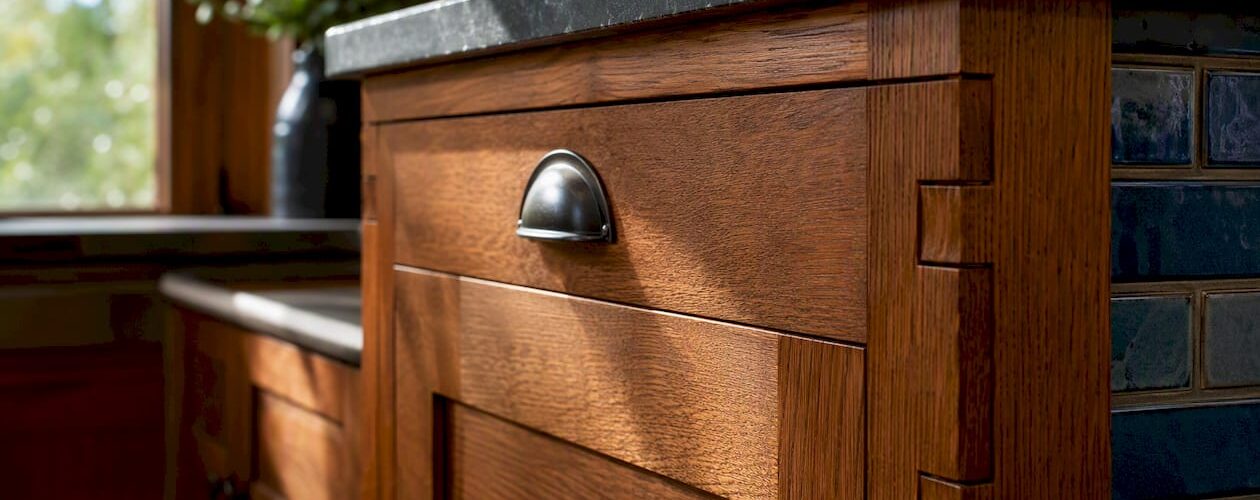
| Wood tone (natural oak) | Warm white quartz, cream or ivory surfaces | Cool gray quartz, stark white |
| Sage or soft green | Warm cream quartz, light wood-look surfaces | Bright white, cool gray |
White and off-white quartz countertops remain the top sellers in 2026, particularly those mimicking Calacatta or Carrara marble with soft gray or warm beige veining. Their popularity reflects a clear preference for surfaces that read clean but carry enough visual texture to avoid looking flat.
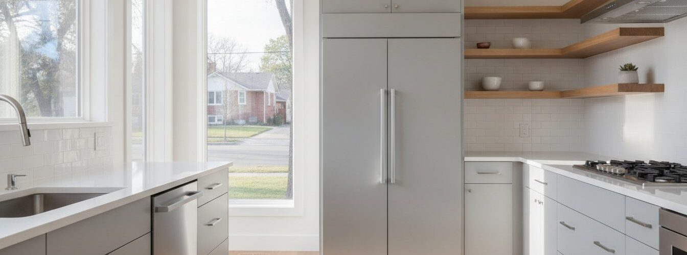
Dark cabinets paired with light countertops create bold contrast and a modern feel. Similar tones across cabinets and countertops produce a softer, more unified look. Neither approach is wrong. The key is that undertones within each approach must still align.
For wood-tone cabinets specifically, avoid stark cool whites with warm wood. The contrast between the wood’s natural warmth and a cold white surface creates visual tension that no amount of styling fixes. Warm white or cream quartz resolves this immediately.
You can find more on current cabinet color trends that pair well with today’s countertop options, including how specific finishes interact with popular stone surfaces.
Steps to test and finalize your color coordination
Testing is the step most homeowners skip. It is also the step that prevents the most expensive mistakes. Follow this sequence before committing to any cabinet and countertop combination.
- Get large samples. Paint a 2-by-2-foot board with your cabinet color. Request a full slab sample or a large offcut from your countertop supplier. Small chips do not show how colors interact at scale.
- Place them vertically in your kitchen. Large vertical testing boards placed next to countertop slabs in the actual kitchen give the most reliable preview. Vertical placement mimics how cabinet doors actually appear in the room.
- Observe at multiple times of day. Check the pairing in morning light, midday, and evening under your kitchen’s artificial lights. Note whether the undertones stay compatible across all conditions.
- Add hardware and backsplash samples. Place a hardware sample between the cabinet board and countertop slab. This shows whether your 10% accent color connects the two or creates a third competing element.
- Resolve undertone conflicts with bridging colors. If the cabinet and countertop undertones clash, transitional elements like hardware finishes can soften the conflict. Warm brass hardware between cool gray cabinets and a warm cream countertop pulls both surfaces toward a shared middle ground.
For deeper guidance on selecting the right paint before you test, the cabinet color selection guide for 2026 covers finish types and color families in detail.
Key Takeaways
Matching cabinet and countertop colors requires undertone alignment, the 60-30-10 rule, and real-world testing under your kitchen’s actual lighting conditions.
| Point | Details |
|---|---|
| Apply the 60-30-10 rule | Assign cabinets 60%, countertops 30%, and hardware 10% of the color palette. |
| Match undertones first | Warm and cool undertones must align between cabinets and countertops to avoid visual conflict. |
| Test under real lighting | Place large sample boards in your kitchen and evaluate them at morning, midday, and evening. |
| Start with cabinets | Choose your cabinet color first since it dominates the visual space, then select countertops to support it. |
| Use hardware as a bridge | When undertones conflict, a shared hardware finish can pull both surfaces toward visual harmony. |
What I have learned after years of watching kitchens come together
The most common mistake I see is treating cabinets and countertops as two separate shopping decisions. Homeowners fall in love with a dramatic countertop slab at a stone yard, buy it, and then try to reverse-engineer a cabinet color that works with it. That approach almost always produces a result that feels slightly off, even when both materials are individually beautiful.
Selecting cabinets and countertops as one integrated system early in the design process is the single change that separates kitchens that look professionally designed from kitchens that look assembled. The difference is not budget. It is sequence and intention.
The other thing I would push back on is the idea that matching means identical. Matching means sharing an undertone direction. A warm sage green cabinet and a warm cream quartz countertop are not the same color. They are not even close. But they share warmth, and that shared quality makes the kitchen feel coherent. Contrast is fine. Undertone conflict is not.
Test more than you think you need to. The homeowners who are happiest with their results are the ones who lived with large sample boards for a week before committing. That extra time costs nothing and prevents regret that costs thousands.
— Jesse
Cabinetsrefinishing can help you get the color right
Choosing the right cabinet color is only half the equation. Getting that color applied with a finish that holds up to daily kitchen use is the other half.
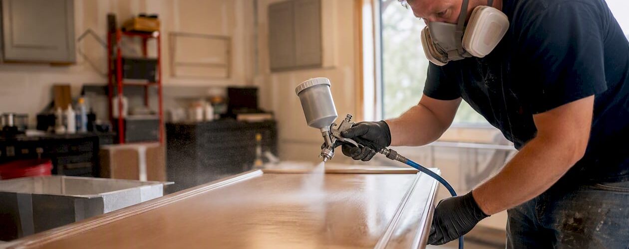
Cabinetsrefinishing uses a factory-finish methodology that applies multiple protective layers over meticulous surface preparation. The result is a durable, professional finish that holds its color accurately against any countertop you pair it with. Projects complete in 3–5 days, and refinishing costs range from $3,000 to $8,000 compared to $15,000 to $40,000 for full cabinet replacement. If you are in the Denver area and ready to update your cabinet color to work with new or existing countertops, contact Cabinetsrefinishing to get started.
FAQ
What is the 60-30-10 rule for kitchen colors?
The 60-30-10 rule assigns 60% of the kitchen’s color palette to cabinets, 30% to countertops and backsplash, and 10% to accent finishes like hardware. It creates visual balance by giving each element a defined role.
What color cabinets work best with white countertops?
White countertops pair well with almost any cabinet color, but the undertone of the white matters. Warm white countertops work best with warm-toned cabinets like cream, wood, or soft greens, while cool white countertops suit gray or navy cabinets.
How do I identify the undertone of my cabinet color?
Hold your cabinet paint chip or door sample next to a pure white sheet of paper. The color shift you see compared to true white reveals whether the undertone is warm, cool, or neutral.
Can dark cabinets work with dark countertops?
Dark cabinets with dark countertops can work when both share the same undertone direction, but the result requires strong contrast from lighting, hardware, or a light backsplash to prevent the kitchen from feeling visually heavy.
How do I fix an undertone conflict between cabinets and countertops?
Use a bridging element such as a hardware finish or backsplash tile that shares undertone qualities with both surfaces. Warm brass hardware, for example, can connect warm wood cabinets to a slightly cooler countertop by introducing a shared warm accent.
Recommended
- Cabinet Color Combinations That Work: 2026 Guide – Cabinet Refinishing and Cabinet Painting Denver 720-219-9716
- How Cabinet Color Affects Kitchen Mood and Ambiance Colorado
- Family-Friendly Kitchen Cabinet Colors: 2026 Guide – Cabinet Refinishing and Cabinet Painting Denver 720-219-9716
- Cabinet Color Selection Refinishing Guide for 2026 – Cabinet Refinishing and Cabinet Painting Denver 720-219-9716