
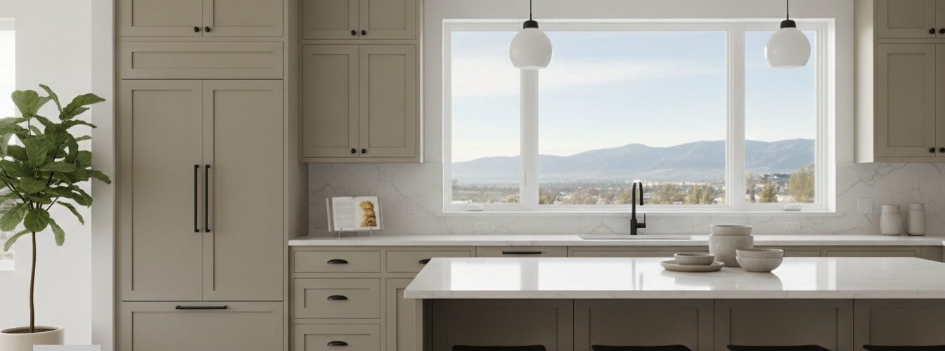
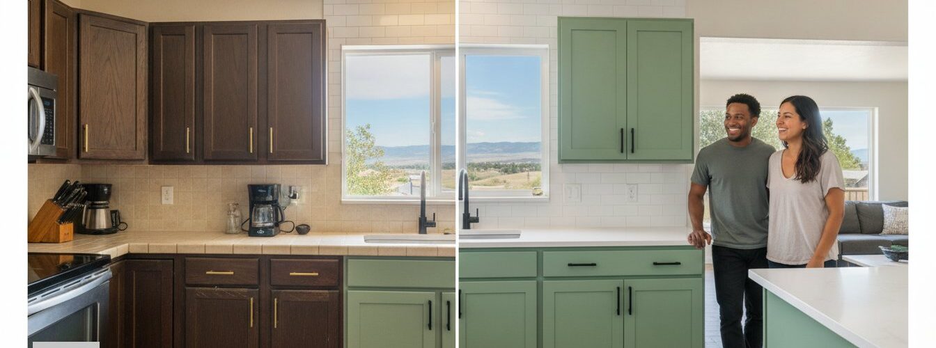
Two-tone kitchen cabinets are defined as cabinetry that uses two distinct colors or finishes to create visual contrast, depth, and functional organization within a single kitchen space. The role of two-tone cabinets in kitchen design goes far beyond aesthetics. These layouts use color placement, proportion, and material undertones to make kitchens feel larger, more intentional, and more livable. The 60-30-10 design rule is the industry standard for achieving visual harmony in two-tone kitchens, and understanding it separates polished results from chaotic ones. Cabinetsrefinishing works with this principle daily, helping Denver homeowners get the look right the first time.
How do two-tone cabinets affect kitchen aesthetics and space?
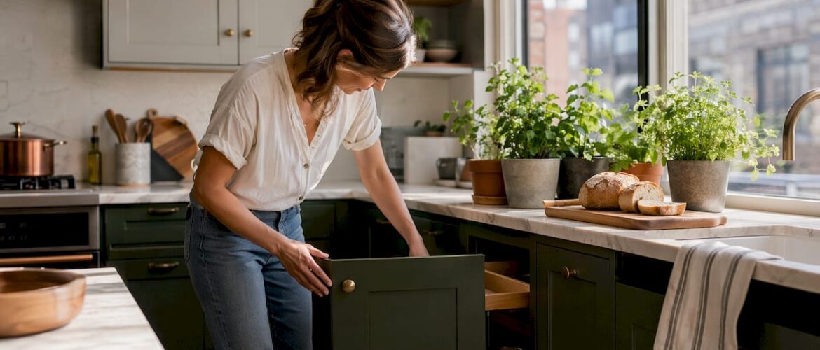
Color placement in a two-tone kitchen directly controls how large, tall, and balanced a space feels. Lighter upper cabinets paired with darker lowers reduce visual weight at eye level, making ceilings appear higher and the room feel more open. Darker lower cabinets also hide scuffs and wear far better than light finishes, which is a practical bonus most homeowners overlook.
The 60-30-10 rule structures this contrast with clear logic. The dominant color covers 60% of the cabinetry, typically the perimeter uppers or lowers. A secondary accent color fills 30%, often the island or lower bank. Hardware, fixtures, and decor fill the remaining 10%. This distribution maintains visual hierarchy and prevents the kitchen from feeling split in two.

| Color distribution strategy | Visual effect | Best suited for |
|---|---|---|
| Light uppers, dark lowers (60/30) | Raises perceived ceiling height | Low-ceiling or compact kitchens |
| Dark uppers, light lowers | Dramatic, moody, grounded feel | Large kitchens with natural light |
| Neutral perimeter, bold island | Focal point without visual overload | Open-concept layouts |
| Matching uppers, contrasting island | Subtle, curated, easy to update | First-time two-tone adopters |
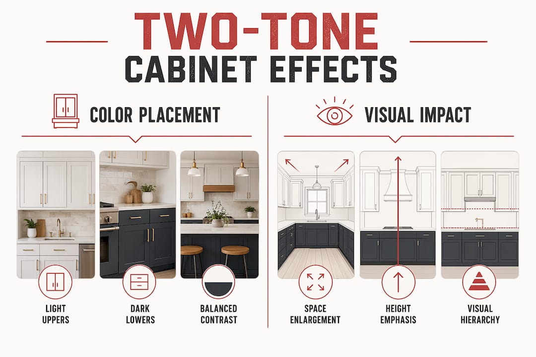
Pro Tip: Never split your cabinet colors 50/50. An equal distribution removes visual hierarchy and makes the kitchen feel fragmented rather than designed.
What functional benefits do two-tone cabinet layouts provide?
Two-tone cabinetry does more than look good. It defines functional zones visually without requiring walls or partitions, which is especially useful in open-concept homes. A contrasting island color signals “prep happens here,” while matching perimeter cabinets communicate “storage lives here.” That visual cue improves workflow without a single word of instruction.
In open-concept living spaces, this zoning benefit becomes even more pronounced. The kitchen reads as its own defined area within a larger room, even when it shares square footage with a dining or living space. Contrasting two-tone zones support workflow by delineating functional areas without walls, enhancing usability across the whole floor plan.
Here are the core functional advantages two-tone layouts deliver:
- Wear concealment. Darker lower cabinets hide everyday scuffs, grease splatter, and door-edge wear far better than uniform light finishes.
- Zone clarity. Color contrast tells everyone in the kitchen where to prep, store, and gather without signage or layout changes.
- Focal point control. A bold island color draws the eye and anchors the room, reducing the need for expensive architectural features.
- Flexibility. Updating one color zone refreshes the entire kitchen without a full repaint.
- Resale signal. Two-tone cabinetry signals intentional design to buyers, differentiating the home from mass-produced single-tone kitchens.
Pro Tip: Match your two-tone layout to your kitchen’s architecture first. If your island sits on the same wall as your perimeter cabinets, a contrasting island color will read as clutter, not design.
How do you choose colors and materials for two-tone cabinets?
Undertone matching is the single most important factor in two-tone color selection. Cool-toned paints pair with cool or neutral woods, while warm paints work with honey-toned or amber woods. Mismatched undertones produce a muddy, unresolved look that no amount of good hardware can fix. Navy blue pairs cleanly with walnut. Cream white works with maple. Those pairings hold because the undertones align.
For 2026, the most enduring two-tone color combinations lean toward soft naturals rather than sharp contrasts. Light oatmeal with sage green, natural oak with warm greige, and cream white with walnut all age well because they avoid trend-driven extremes. These pairings feel timeless rather than dated after three years. You can explore the full range of current options in this 2026 color guide from Cabinetsrefinishing.
| Tone pairing | Compatible wood | Hardware recommendation |
|---|---|---|
| Navy blue + cream white | Walnut, dark oak | Brushed brass or matte gold |
| Sage green + warm greige | Maple, light oak | Matte black or brushed nickel |
| Charcoal + soft white | White oak, ash | Polished chrome or satin nickel |
| Cream white + natural oak | Maple, birch | Brushed brass or antique bronze |
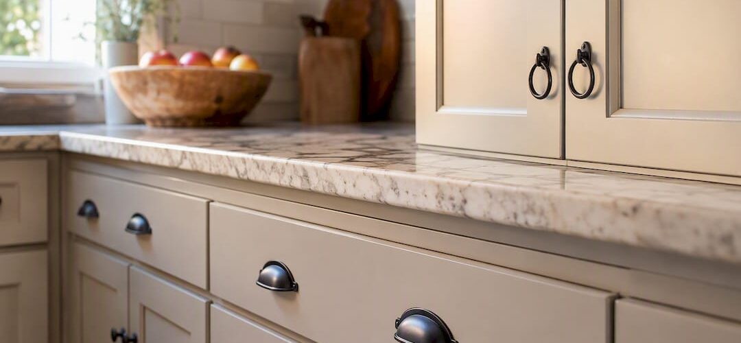
Using the same hardware finish across both cabinet colors is one of the most effective ways to unify a two-tone kitchen. Matte black hardware works across warm and cool palettes. Brushed brass adds warmth without overpowering either color zone. Hardware acts as the thread that ties both tones together visually.
A contrasting island is the lowest-risk entry point for homeowners new to two-tone design. Refinishing only the island requires less material, less time, and less commitment than repainting all perimeter cabinetry. It also allows for future updates without touching the rest of the kitchen. For guidance on coordinating cabinet colors with countertops, Cabinetsrefinishing’s countertop coordination guide covers the key decisions clearly.
What mistakes should you avoid with two-tone cabinetry?
The 50/50 color split is the most common and most damaging mistake in two-tone kitchen design. Equal distribution removes visual hierarchy and creates a fragmented look that reads as indecision rather than design. The dominant color must clearly lead, with the accent color playing a supporting role.
Effective two-tone kitchens solve a spatial or architectural problem rather than simply following trends. A two-tone layout applied without purpose, such as adding a contrasting island in a galley kitchen with no island, produces visual clutter. The design logic must match the layout.
Here are the most critical errors to avoid, in order of impact:
- Ignoring undertones. Pairing a cool gray with a warm honey wood creates muddiness that no lighting fix can resolve.
- Splitting colors equally. A 50/50 split eliminates the visual anchor the design needs to feel intentional.
- Mismatching hardware finishes. Using chrome on one zone and brass on another fractures the design rather than unifying it.
- Choosing trend colors over timeless ones. Bold trendy colors date quickly. Soft naturals hold their appeal across market cycles.
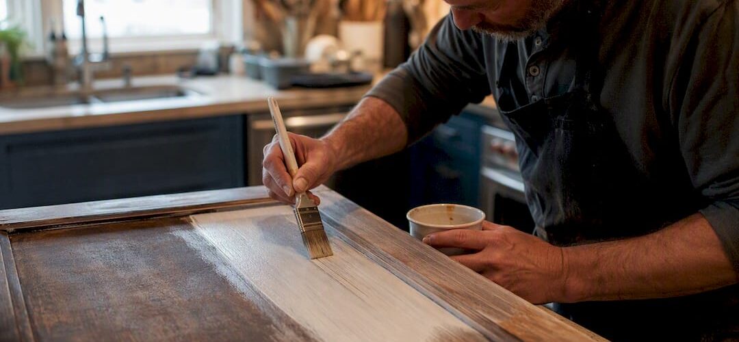
- Skipping surface preparation. Poor prep produces uneven color absorption, especially on wood grain, which undermines the entire two-tone effect.
- Applying two-tone without a layout rationale. Every color zone should correspond to a functional or spatial purpose.
Two-tone kitchens increase resale value when executed well because buyers read them as custom and curated. A poorly executed two-tone kitchen, with clashing undertones or equal splits, has the opposite effect. Proportion, undertone alignment, and a clear layout rationale are the three factors that separate a successful project from a costly mistake. Cabinetsrefinishing’s two-tone painting guide walks through each of these factors in detail.
Key Takeaways
Two-tone kitchen cabinets succeed when color proportion, undertone alignment, and layout rationale work together rather than any single factor alone.
| Point | Details |
|---|---|
| Follow the 60-30-10 rule | Use 60% dominant color, 30% accent, and 10% hardware to maintain visual hierarchy. |
| Match undertones precisely | Cool paints pair with cool woods; warm paints pair with honey-toned woods to avoid muddiness. |
| Avoid the 50/50 split | Equal color distribution removes visual anchor and makes kitchens feel fragmented. |
| Start with the island | Refinishing only the island is the lowest-risk, lowest-cost entry into two-tone design. |
| Unify with hardware | One consistent hardware finish across both color zones ties the design together. |
Why two-tone kitchens are worth the effort, done right
Two-tone cabinetry emerged as a direct response to all-white kitchen fatigue. Designers noticed that homeowners who went all-white in the early 2010s were the first to feel their kitchens looked dated by 2020. The shift toward warm minimalism and layered color was not a trend. It was a correction.
Cabinet Painting Service Areas in Denver & Surrounding Cities, Cabinet Refinishing in Denver County,
Serving Lakewood, CO, Littleton, CO, Golden, CO, Evergreen CO, Roxborough Park CO, Ken Carl Ranch CO,
Arvada, CO, Wheat Ridge, CO,
and Parker CO. Castle Pines CO. Englewood CO. Centennial CO.
Cabinet Painting in Arapahoe County, CO
Including Centennial, CO, Greenwood Village, CO,
Cherry Hills Village, CO, Englewood, CO,
and Aurora, CO.
Cabinet Painting in Adams County & Broomfield, CO
Serving Lakewood, CO, Littleton, CO, Golden, CO, Evergreen CO, Roxborough Park CO, Ken Carl Ranch CO,
Arvada, CO, Wheat Ridge, CO,
and Parker CO. Castle Pines CO. Englewood CO. Centennial CO.
Cabinet Painting in Arapahoe County, CO
Including Centennial, CO, Greenwood Village, CO,
Cherry Hills Village, CO, Englewood, CO,
and Aurora, CO.
Cabinet Painting in Adams County & Broomfield, CO
What I have seen consistently is that homeowners who invest in two-tone layouts with a clear spatial rationale never regret it. The ones who struggle are those who chose two colors because they liked both, without thinking about proportion or undertone. The kitchen ends up looking like two separate rooms sharing a floor plan.
The most underrated aspect of two-tone design is its adaptability. Because the island or lower cabinets are a distinct zone, updating the accent color in five years does not require touching the entire kitchen. That modularity makes two-tone cabinetry one of the most future-proof choices a homeowner can make. It also makes refinishing, rather than replacement, the obvious financial decision. A full kitchen replacement runs $15,000 to $40,000. A professional refinish that achieves the same two-tone result costs $3,000 to $8,000 and takes 3–5 days.
The design principle that matters most is this: two-tone works when it solves a problem. It makes a low-ceiling kitchen feel taller. It defines zones in an open-concept space. It creates a focal point where architecture provides none. When the color choice serves the space, the result feels inevitable rather than decorated.
— Jesse
Cabinetsrefinishing brings two-tone kitchens to life in Denver
Getting a two-tone kitchen right requires more than choosing two colors. It requires precise surface preparation, undertone-matched finishes, and a factory-quality application that holds up to daily use.
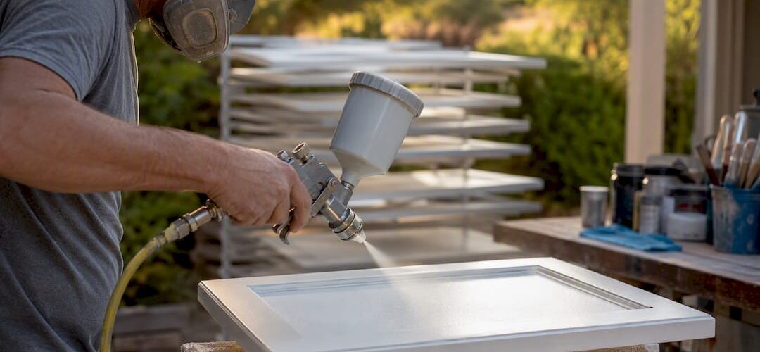
Cabinetsrefinishing specializes in exactly this kind of work. Their factory-finish methodology applies multiple protective layers over meticulous prep, producing results that look custom and last for years. Projects complete in 3–5 days, not weeks, and cost a fraction of full cabinet replacement. Whether you want to start with a contrasting island or go full upper-and-lower contrast, the team at cabinet refinishing Denver can match your undertones, execute your layout, and deliver a finish that holds. Call or text 720-219-9716 to get started.
FAQ
What is the role of two-tone cabinets in kitchen design?
Two-tone cabinets add visual depth, define functional zones, and make kitchens feel larger and more custom. They use color contrast and proportion to solve spatial problems that single-tone layouts cannot address.
What is the 60-30-10 rule for two-tone kitchens?
The 60-30-10 rule assigns 60% of cabinet space to the dominant color, 30% to the accent color, and 10% to hardware and décor. This proportion maintains visual hierarchy and prevents a fragmented look.
What are the best two-tone kitchen color ideas for 2026?
Soft natural pairings like light oatmeal with sage green, natural oak with warm greige, and cream white with walnut age well and avoid sharp trend-driven contrasts that date quickly.
How do you style two-tone cabinets without making them look busy?
Use one consistent hardware finish across both color zones and follow the 60-30-10 proportion rule. Avoid equal color splits and match undertones between paint and wood finishes.
Does a two-tone kitchen increase home resale value?
Well-executed two-tone kitchens signal intentional, custom design to buyers, which increases perceived value in competitive markets. Poor execution, such as clashing undertones or equal color splits, has the opposite effect.
Recommended
- Painting Just Upper or Lower Cabinets: Denver’s Guide to the Two-Tone Kitchen Trend – Cabinet Refinishing and Cabinet Painting Denver 720-219-9716
- Cabinet Color Combinations That Work: 2026 Guide – Cabinet Refinishing and Cabinet Painting Denver 720-219-9716
- Kitchen Cabinet Color Trends 2026: What’s Hot Right Now – Cabinet Refinishing and Cabinet Painting Denver 720-219-9716
- Two-Tone Kitchen Cabinet Refinishing, Paint Guide for DIYers