

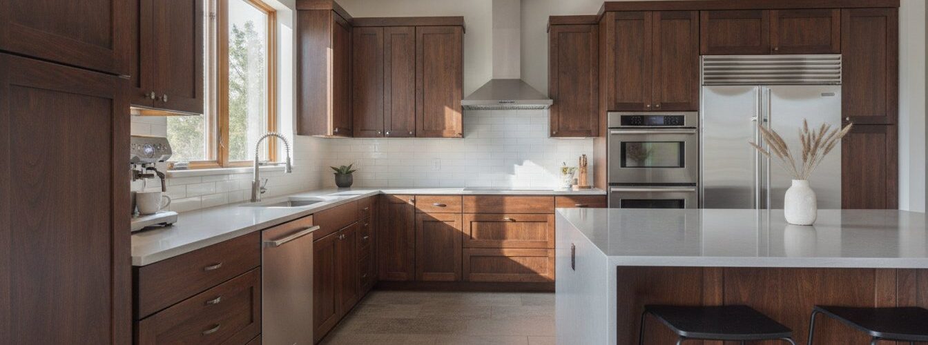

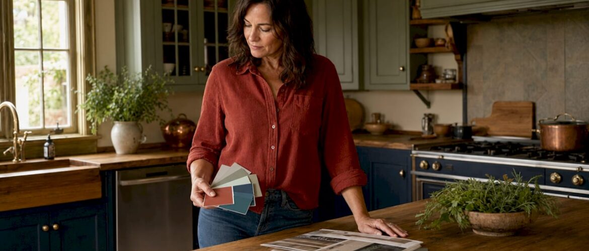
Cabinet color is the single most dominant design decision in any kitchen, setting the tone for every other element in the room. A cohesive kitchen design, what interior designers formally call color harmony, means your cabinets, countertops, flooring, backsplash, and hardware all speak the same visual language. This kitchen decor cohesion cabinet color guide walks you through the exact process: reading your fixed elements, applying the 60-30-10 rule, selecting from 2026’s strongest cabinet color combinations, and testing finishes before you commit. Get this right and your kitchen feels intentional. Get it wrong and even expensive materials look disjointed.
How to assess your kitchen’s fixed elements before choosing cabinet color
The biggest mistake homeowners make is choosing a cabinet color they love in isolation, without accounting for the countertops, flooring, and backsplash already in the room. Those fixed elements are not going anywhere, and they carry undertones that will either reinforce or fight your cabinet color.
Cabinet Painting Service Areas in Denver & Surrounding Cities, Cabinet Refinishing in Denverc County,
Serving Lakewood, CO, Littleton, CO, Golden, CO, Evergreen CO, Roxborough Park CO, Ken Carl Ranch CO,
Arvada, CO, Wheat Ridge, CO,
and Parker CO. Castle Pines CO. Englewood CO. Centennial CO.
Cabinet Painting in Arapahoe County, CO
Including Centennial, CO, Greenwood Village, CO,
Cherry Hills Village, CO, Englewood, CO,
and Aurora, CO.
Cabinet Painting in Adams County & Broomfield, CO
Start by identifying the undertones in your countertops and flooring. Warm undertones appear as yellow, beige, red, or brown tones in the material. Cool undertones read as gray, blue, or green. Granite with pink veining is warm. White marble with blue-gray veining is cool. Honey-toned hardwood floors are warm. Gray tile floors are cool. Mixing warm cabinets with cool countertops does not always fail, but it requires deliberate contrast rather than accidental collision.

The most reliable method for reading undertones is to look at the secondary colors embedded in the material. Veins and specks in countertops are not decorative noise. They are a color palette waiting to be used. A quartz countertop with subtle sage-green veining practically tells you which cabinet color will make it sing.
Here is what to evaluate before you pull a single paint chip:
- Countertops: Identify the dominant color and the secondary tones in veins or flecks.
- Flooring: Note whether the wood grain or tile reads warm (amber, honey, tan) or cool (ash, gray, slate).
- Backsplash: If you have one, its grout color and tile finish carry undertones that affect the whole room.
- Appliances: Stainless steel reads cool and slightly blue. Black stainless reads warmer. Panel-ready appliances take on whatever color surrounds them.
- Natural light direction: North-facing kitchens receive cool, flat light all day. South-facing kitchens get warm, shifting light. This changes how every color reads on your cabinets.
Pro Tip: Cut paint samples to at least 8 by 10 inches and tape them directly to your cabinet doors. View them at 7 a.m., noon, and 7 p.m. under both natural and artificial light. A color that looks perfect at noon can turn muddy or green-tinged by evening.
What are the best cabinet colors for cohesive kitchen design in 2026?
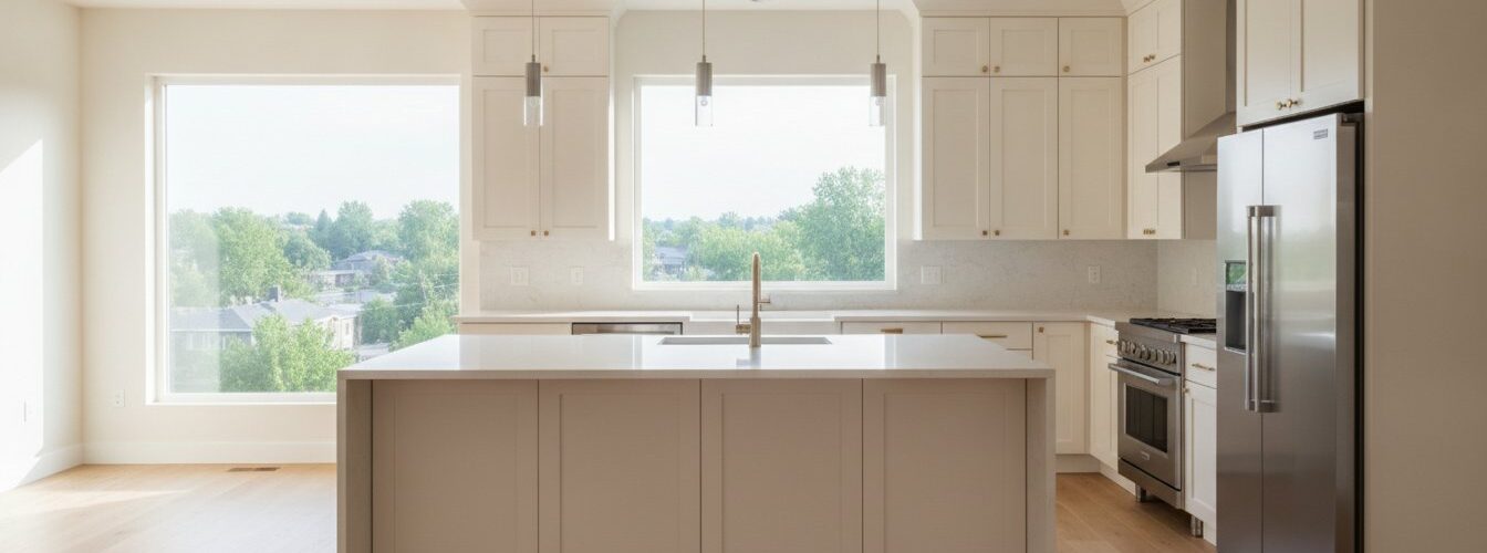
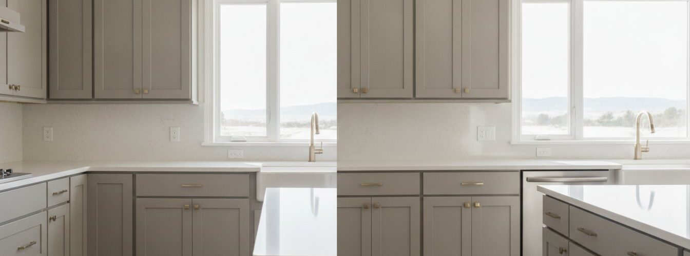
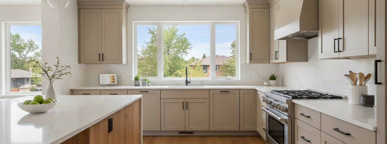
White and off-white remain the most popular cabinet colors across American kitchens, and their dominance is not accidental. They reflect light, pair with almost any countertop material, and give you maximum flexibility with accent colors. The distinction between true white and off-white matters more than most homeowners realize. True white (think Benjamin Moore Chantilly Lace) reads crisp and modern. Off-white (like Sherwin-Williams Alabaster) reads warm and relaxed. Choose based on your countertop’s undertone, not personal preference alone.
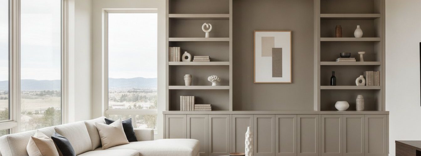
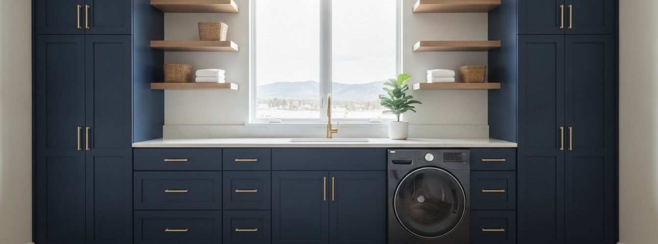
Beyond white, 86% of designers predict earthy shades, especially greens, will dominate kitchen designs in 2026. Sage green has become the decade’s defining cabinet color because it bridges warm and cool undertones, pairs naturally with both brass and matte black hardware, and reads as organic rather than trendy. Navy blue has followed a similar trajectory, surging in popularity because it grounds a kitchen without making it feel dark when used correctly.
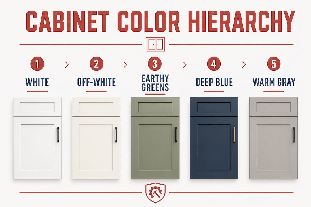
The table below shows the most effective cabinet color combinations for cohesive kitchen design right now:
| Cabinet color | Best countertop pairing | Hardware finish | Overall mood |
|---|---|---|---|
| White/off-white | Calacatta marble, quartz | Matte black, brushed nickel | Clean, timeless |
| Sage green | Warm white quartz, butcher block | Unlacquered brass | Organic, relaxed |
| Navy blue | White marble, light gray quartz | Polished brass, gold | Bold, sophisticated |
| Warm gray | Concrete, veined quartz | Brushed nickel, chrome | Modern, neutral |
| Earth tones (terracotta, clay) | Cream stone, travertine | Aged bronze, brass | Warm, artisanal |
Two-tone kitchens represent one of the strongest tools for cohesive kitchen design because they solve the visual weight problem that bold colors create. Dark tones on lower cabinets ground the space and make the room feel anchored. Lighter colors on upper cabinets keep the eye moving upward and prevent the kitchen from feeling compressed. A navy lower cabinet paired with an off-white upper cabinet, for example, gives you the drama of a bold color without the claustrophobic effect of navy on all four walls of cabinetry. For a detailed breakdown of this approach, the two-tone kitchen guide from Cabinetsrefinishing covers the execution in full.
Brass hardware warms deep green and navy cabinets while matte black adds a modern edge to white and light gray cabinetry. Hardware is not an afterthought. It is the punctuation that makes the sentence of your cabinet color readable.
How does the 60-30-10 rule create a balanced kitchen color scheme?
The 60-30-10 rule is the most practical framework for distributing color in a kitchen without professional design training. It works because it mirrors the way the human eye naturally seeks visual hierarchy. One color dominates, one supports, and one punctuates.
Here is how the rule maps onto a real kitchen:
- 60% primary color. This is almost always your cabinet color, since cabinets cover the most visual surface area in the room. If your cabinets are sage green, sage green is your primary color and everything else responds to it.
- 30% secondary color. This covers your walls, backsplash, and larger countertop surfaces. The secondary color should share an undertone with the primary. Warm sage green pairs with a warm cream wall. Cool sage green pairs with a soft gray or white backsplash.
- 10% accent color. Hardware, faucets, light fixtures, and small decor items carry the accent. This is where you introduce contrast or a pop of personality. Unlacquered brass on sage green cabinets is a classic 10% accent that ties the whole room together.
The most common error homeowners make when decorating kitchen cabinets is inverting this ratio. They choose a bold accent color and then try to build a room around it. That approach forces every other element to compete rather than complement. The 60-30-10 rule prevents that by establishing a clear hierarchy before you buy a single can of paint.
Pro Tip: If you are unsure whether your secondary color works, photograph your kitchen and convert the image to grayscale. If the tonal values (light to dark) feel balanced in black and white, the color proportions are almost certainly correct in real life.
A practical example: a kitchen with warm gray lower cabinets (60%), a white subway tile backsplash with warm gray grout (30%), and brushed gold hardware (10%) achieves cohesion because each layer reinforces the same warm-neutral direction. Nothing competes. Everything belongs.
How does lighting affect cabinet color and finish choices?
Light is not a passive backdrop for your cabinet color. It is an active participant that changes the color’s appearance every hour of the day. Testing color samples at multiple times of day is the single most important step most homeowners skip, and it is the reason a color that looked perfect in the store looks wrong on the wall.
Paint finish sheen is equally consequential. High-gloss finishes intensify color and reflect light aggressively, which makes colors appear more saturated and the space feel larger. Matte finishes absorb light, soften the color’s intensity, and hide surface imperfections like brush marks or minor dents. Satin and semi-gloss fall between these extremes and are the most practical choices for kitchen cabinets because they balance durability with a forgiving sheen level.
Consider these factors when evaluating finish for your specific kitchen:
- North-facing kitchens benefit from satin or semi-gloss finishes because the added reflectivity compensates for the flat, cool light.
- South-facing kitchens with abundant warm light can handle matte or satin finishes without the space feeling dim.
- Under-cabinet lighting (LED strips in particular) creates a warm pool of light that makes cool cabinet colors shift slightly yellow. Test your sample with the under-cabinet lights on.
- Overhead recessed lighting with a high color rendering index (CRI of 90 or above) shows cabinet colors most accurately and is the closest to natural daylight indoors.
The best sheen for kitchen cabinet paint depends on your kitchen’s light conditions and how much traffic the cabinets receive. Cabinetsrefinishing covers this in detail for Denver homeowners dealing with Colorado’s intense natural light.
Pro Tip: Use different finish levels to add dimension without changing color. Paint your upper cabinets in satin and your lower cabinets in semi-gloss using the same color. The subtle sheen difference creates visual depth and makes the kitchen feel more layered and designed.
Key takeaways
Cabinet color cohesion requires reading your kitchen’s fixed undertones first, then applying the 60-30-10 rule to distribute color across cabinets, walls, and accents with deliberate proportion.
| Point | Details |
|---|---|
| Read fixed undertones first | Identify warm or cool tones in countertops and flooring before selecting any cabinet color. |
| Apply the 60-30-10 rule | Assign 60% to cabinets, 30% to walls and backsplash, and 10% to hardware and accents. |
| Use two-tone strategically | Place darker colors on lower cabinets and lighter colors on uppers to balance visual weight. |
| Test samples in real light | View paint samples at multiple times of day under both natural and artificial kitchen lighting. |
| Match hardware to cabinet tone | Brass warms dark greens and navies; matte black sharpens whites and light grays. |
Why I think most homeowners overcomplicate cabinet color selection
After working alongside kitchen renovation projects for years, the pattern I see most often is homeowners who spend weeks agonizing over paint chips while ignoring the one thing that determines whether any color works: the undertone of their existing countertop.
I have watched homeowners choose a beautiful warm white cabinet color, only to have it look dingy and yellow next to a cool gray quartz countertop. The color was not wrong. The pairing was wrong. The fix is always the same: go back to the fixed elements and let them lead.
The 60-30-10 rule sounds like a design school formula, but it is really just a permission structure. It gives you a reason to stop second-guessing and start committing. Most kitchens that feel “off” are not suffering from a bad color choice. They are suffering from no clear hierarchy. One color is trying to do everything.
My honest recommendation for anyone decorating kitchen cabinets in 2026: choose a color that shares an undertone with your countertop, apply it at 60% of the visual surface, and let your hardware do the heavy lifting at the 10% accent level. Sage green with unlacquered brass on a warm quartz countertop is not a trend. It is a formula that works, and it will keep working long after the trend cycle moves on. Test thoroughly, commit confidently, and resist the urge to add a third color just because you can.
— Jesse
Ready to bring your cabinet color vision to life?
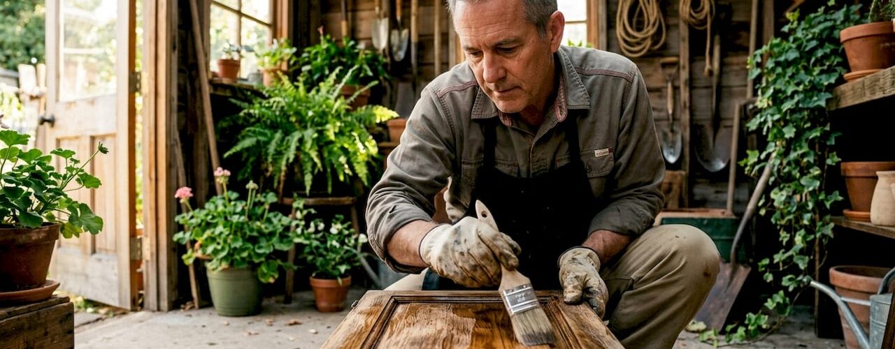
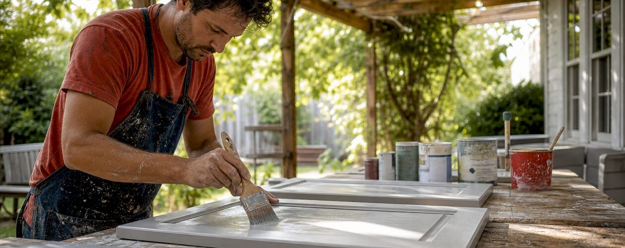
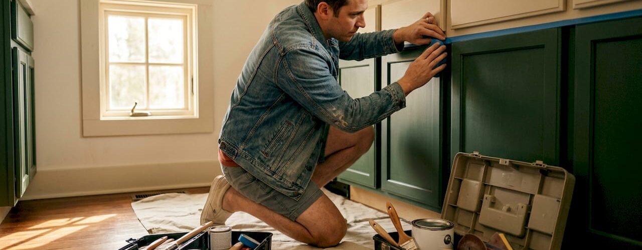
Choosing the right color is only half the equation. The finish quality determines whether that color looks like a professional kitchen or a weekend DIY project five years from now.
Cabinetsrefinishing uses a factory-finish methodology with meticulous surface preparation and multiple protective layers to deliver cabinet colors that hold up to daily kitchen use. Projects run 3 to 5 days, and refinishing costs range from $3,000 to $8,000 compared to the $15,000 to $40,000 that full cabinet replacement typically requires. Whether you are moving toward navy blue, sage green, or a warm off-white, the cabinet refinishing process Cabinetsrefinishing follows produces results that hold color accurately and resist chipping. Explore your options with a consultation and see what a professional finish does for your kitchen’s cohesion.
FAQ
What is the best cabinet color for a cohesive kitchen?
White, off-white, and sage green are the most reliably cohesive cabinet colors because they pair with the widest range of countertop materials and hardware finishes. The best choice depends on the undertones of your existing fixed elements, not personal preference alone.
How do I use the 60-30-10 rule for kitchen color?
Assign your cabinet color to 60% of the visual space, your walls and backsplash to 30%, and your hardware and small accents to the remaining 10%. This distribution creates a clear color hierarchy that prevents any single element from overwhelming the room.
Should upper and lower cabinets be the same color?
Two-tone kitchens work best with darker colors on lower cabinets and lighter colors on upper cabinets. This grounds the space visually and keeps the upper portion of the kitchen feeling open and airy.
How does lighting change cabinet color appearance?
Natural light shifts throughout the day and changes how undertones read on cabinet surfaces. A color that appears neutral at noon can read green or yellow by evening. Always test paint samples at multiple times of day before committing to a color.
Does hardware finish affect kitchen cohesion?
Hardware finish is a critical factor in cohesion. Brass and gold finishes warm dark cabinet colors like navy and forest green. Matte black and brushed nickel sharpen lighter cabinets like white and warm gray. Mismatched hardware finish is one of the most common reasons a kitchen feels unfinished despite a strong cabinet color choice.
Recommended
- Painting Kitchen Cabinets Navy Blue: The Denver Homeowner’s Guide to a High-End Finish – Cabinet Refinishing and Cabinet Painting Denver 720-219-9716
- Painting Kitchen Cabinets Gray: The Professional Guide for Denver Homeowners – Cabinet Refinishing and Cabinet Painting Denver 720-219-9716
- The Best Sheen for Kitchen Cabinet Paint: A Professional Denver Guide – Cabinet Refinishing and Cabinet Painting Denver 720-219-9716
- Preventing Yellowing on White Painted Cabinets: The Ultimate Denver Homeowner’s Guide (2026) – Cabinet Refinishing and Cabinet Painting Denver 720-219-9716