Cabinet color combinations that work are defined by three factors: tone contrast, undertone harmony, and correct color placement across upper and lower cabinets. Get all three right and your kitchen looks intentional, spacious, and current. Miss one and even expensive paint looks off. This guide covers the most effective pairings validated by designers in 2026, the technical principles behind why they succeed, and a practical process for testing colors in your own home before committing.
1. What are the best two-tone cabinet color combinations that work?
Two-tone cabinet design is the most requested approach in kitchen renovations right now. It creates visual depth without requiring a full remodel. The combinations below are validated by designers and backed by Light Reflectance Value (LRV) data, which measures how much light a color reflects on a scale from 0 (black) to 100 (white).
The most proven pairings include:
-
White perimeter cabinets with a sage green island. Sherwin-Williams Evergreen Fog (SW 9130, LRV 30) is the most requested kitchen green right now. Pairing it with a bright white perimeter creates a 50+ point LRV contrast that reads as clean and grounded.
-
White uppers with a navy blue island. Benjamin Moore White Dove (LRV 85) paired with Sherwin-Williams Naval (LRV 4) achieves an 81-point LRV contrast. That gap is large enough to feel dramatic without looking chaotic.
-
Cream uppers with natural wood or walnut lowers. Warm white uppers share yellow undertones with walnut, so the two colors read as a family rather than a mismatch. This pairing also connects to the broader shift toward earthy neutrals over cool grays.
-
White perimeter cabinets with a charcoal island. Charcoal grounds the kitchen without the starkness of black. It pairs well with both warm and cool whites, depending on the undertone of the gray you select.
-
Greige uppers with a deep forest green island. Greige (a gray-beige blend) shares warm undertones with forest green, creating a cohesive palette that feels both current and timeless.
Pro Tip: Always place the darker color on lower cabinets or the island. Darker tones on uppers make ceilings feel lower and kitchens feel cramped.
2. Which single-color and bold cabinet choices work best?
Single-color kitchens succeed when the chosen color is saturated enough to carry the whole room. Pale, washed-out colors on every surface tend to flatten the space. Bold, deep colors do the opposite.
The most effective single-color choices are:
- White or off-white: The most forgiving option. Works in nearly any light condition and pairs with any countertop or backsplash material.
- Deep navy: Hides fingerprints and wear better than lighter colors. Works especially well in matte finish.
- Forest green: Feels grounded and warm. Pairs naturally with brass or unlacquered bronze hardware.
- Charcoal or near-black: Creates a dramatic, high-contrast kitchen. Best used with light countertops and pale walls.
- Warm gray: A safer alternative to cool gray, which has largely faded from trend forecasts.
Saturated deep colors like navy, charcoal, and forest green mask wear better than whites or lights in busy kitchens. That is a practical advantage most homeowners overlook when choosing paint. Pairing these deeper tones with lighter walls or uppers maintains visual height and avoids heaviness.
Pro Tip: In a single-color kitchen, vary the finish rather than the color. Matte lowers with a satin sheen on uppers adds dimension without introducing a second hue.
For subtle pairing ideas, use warm metals like brushed brass or unlacquered bronze as hardware. Natural materials like open wood shelving or a butcher block countertop add warmth without competing with bold cabinet colors.
3. How to test cabinet colors based on your home’s lighting
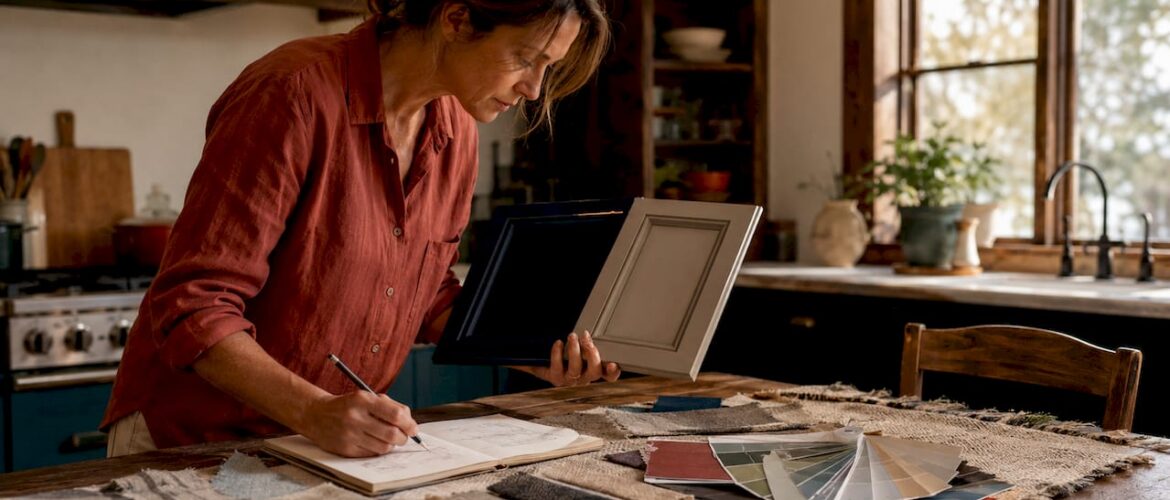
Testing paint samples at home is the single most important step most homeowners skip. A color that looks perfect in a store or on a screen can shift dramatically under your kitchen’s specific light conditions.
Follow this process before buying a full gallon:
-
Buy large sample cards or paint a 12-by-12-inch patch directly on the cabinet door. Small chips are too small to read accurately at room scale.
-
Observe the sample at three times of day: morning, midday, and evening. Light temperature changes throughout the day and affects how colors read.
-
Check the compass orientation of your kitchen. North-facing light makes colors cooler and grayer; south-facing light amplifies warmth and yellow undertones. This single factor can make a warm white look pink or a cool gray look purple.
-
Hold the sample against a sheet of white paper. This reveals the true undertone of the color. A color that looks neutral on its own may show green, pink, or yellow next to pure white.
-
Compare the sample against your flooring and countertop. Comparing samples against existing materials prevents undertone clashes that only become visible after the full job is done.
-
Check the LRV difference between your chosen cabinet color and your wall color. An LRV difference of at least 20 between coordinating colors prevents visual clashes and ensures intentional contrast.
For Denver homeowners specifically, the high-altitude light is notably bright and can wash out lighter colors. Check out this Denver-specific color guide for lighting-adjusted recommendations.
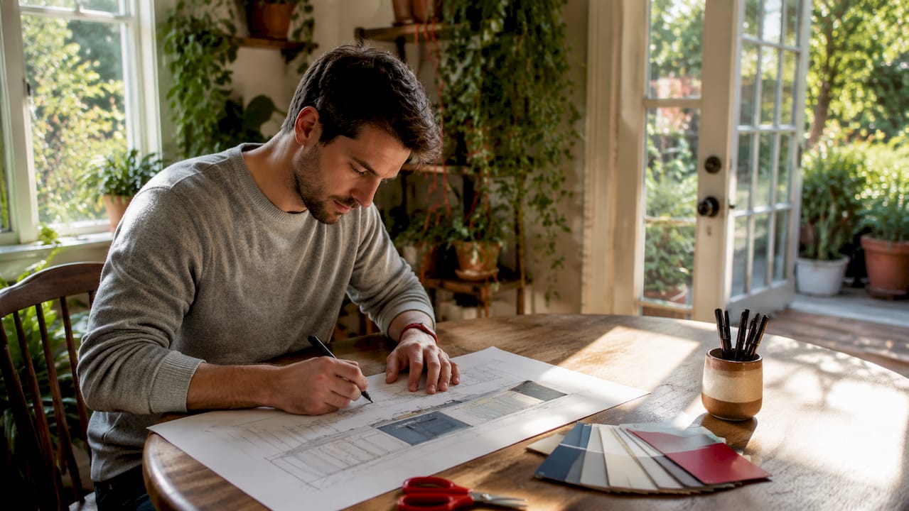
4. What design principles make cabinet colors work together?
Color choice alone does not create a cohesive kitchen. Placement and proportion matter just as much. Two proven principles govern how professional designers structure cabinet color schemes.
The 60-30-10 rule is the most reliable framework for kitchen color balance. The 60-30-10 rule assigns 60% of the visual space to a dominant color (typically the perimeter cabinets), 30% to a secondary color (the island, walls, or lower cabinets), and 10% to an accent (hardware, lighting fixtures, or a tile detail). Ignoring this ratio leads to cluttered or unbalanced spaces.
Placement of light and dark tones is equally critical. Darker colors on lower cabinets or islands visually lighten the eye-level space and ground the kitchen. Reversed placement creates a top-heavy feeling unless the kitchen has very high ceilings or unusually large square footage.
Key structural principles at a glance:
- Lighter uppers, darker lowers: The standard placement for a reason. It mirrors how light naturally falls in a room.
- Undertone matching: Shared warm or cool undertones between colors increase harmony. Mismatched undertones cause visual discord even when the colors seem similar.
- Finish type affects perceived color: Glossy finishes reflect more light and make colors appear lighter and more saturated. Matte finishes absorb light and make colors appear deeper and more muted.
- Anchor with a hero color: Select one dominant color first, then build secondary and accent tones around its undertones.
| Design principle | Effect on the kitchen |
|---|---|
| 60-30-10 color rule | Balances visual weight across cabinets, walls, and accents |
| Darker tones on lowers | Grounds the space and prevents a top-heavy appearance |
| LRV contrast of 20+ | Creates intentional contrast and prevents muddy pairings |
| Undertone matching | Unifies colors that might otherwise fight each other |
| Matte vs. glossy finish | Alters perceived depth and lightness of the same color |
For a deeper look at two-tone placement strategies, the two-tone cabinet guide from Cabinetsrefinishing covers structural decisions in detail.
Key takeaways
The most effective cabinet color combinations balance LRV contrast, undertone harmony, and correct light-to-dark placement across upper and lower cabinets.
| Point | Details |
|---|---|
| Use LRV contrast of 20+ | A gap of at least 20 LRV points between colors prevents muddy or clashing pairings. |
| Place darker tones on lowers | Dark uppers compress ceiling height; dark lowers ground the space naturally. |
| Match undertones first | Warm colors pair with warm, cool with cool. Mismatched undertones cause discord. |
| Follow the 60-30-10 rule | Assign 60% to dominant, 30% to secondary, and 10% to accent colors for balance. |
| Test samples in your actual kitchen | Lighting direction and time of day change how colors read on your specific cabinets. |
Why I stopped chasing trends and started choosing for longevity
The most common mistake I see homeowners make is picking a color because it looked great in a magazine photo. Magazine kitchens are styled under controlled lighting, with props and materials chosen specifically to flatter that one color. Your kitchen is not a photo shoot.
The combinations that hold up over years are the ones built on undertone logic, not trend logic. Warm whites with walnut wood have worked for decades because they share yellow undertones. Navy with brass hardware has worked since the 1920s because the contrast is mathematically sound. These are not trends. They are color relationships.
I also think homeowners underestimate how much fewer shades with quality finishes outperform complex multi-color palettes. Three colors, applied with precision and the right sheen, look more expensive than six colors applied carelessly. Restraint is the actual design skill here.
The one trend I do endorse for 2026 is the move toward warm earthy neutrals over cool grays. Cool gray has aged poorly in most kitchens because it fights warm wood floors and warm-toned countertops. Greige, mushroom, and warm white are more forgiving palettes that age well as other materials in the kitchen change over time.
If you are unsure whether your chosen combination will work, do not guess. Get a professional opinion before you commit to a full refinish. The cost of a consultation is nothing compared to the cost of redoing the job.
— Jesse
Get your color combination done right with Cabinetsrefinishing
Choosing the right colors is only half the job. The finish quality determines whether those colors look professional or amateur five years from now. Cabinetsrefinishing uses a factory-finish methodology with multiple protective layers, so your chosen color holds up to daily kitchen use without chipping, yellowing, or peeling.
Projects are completed in 3–5 days, and refinishing costs range from $3,000 to $8,000 compared to $15,000 to $40,000 for full cabinet replacement. You get the color transformation you want at a fraction of the cost. Denver homeowners can get a refinishing quote today or explore the full range of 2026 color trends Cabinetsrefinishing currently offers.
FAQ
What are the most popular kitchen cabinet colors in 2026?
Warm earthy neutrals including greige, mushroom tones, and warm white are the most requested colors in 2026, replacing the cool grays that dominated the previous decade. Deep navy, forest green, and charcoal remain strong choices for islands and lower cabinets.
How much LRV contrast do two-tone cabinets need?
An LRV difference of at least 20 between two coordinating colors prevents visual clashing and creates intentional contrast. The Benjamin Moore White Dove and Sherwin-Williams Naval pairing achieves an 81-point LRV contrast, which is one of the most dramatic validated combinations available.
Should darker cabinets go on top or bottom?
Darker colors belong on lower cabinets or the island. Placing dark colors on upper cabinets compresses the perceived ceiling height and makes the kitchen feel smaller, unless the space has very high ceilings.
How do I know if two cabinet colors share the same undertone?
Hold both paint samples against a sheet of white paper in natural light. If both shift toward the same secondary hue (both go slightly warm, or both go slightly cool), their undertones are compatible. If one goes pink and the other goes green, they will fight each other on the wall.
Can I use bold colors like navy or forest green on all cabinets?
Yes. Saturated deep colors like navy and forest green mask wear better than lighter colors and hold up well in high-traffic kitchens. Pair them with light walls, natural wood accents, or warm metal hardware to prevent the space from feeling too dark.
Recommended
- Kitchen Cabinet Color Trends 2026: Denver’s Guide to Modern Refinishing – Cabinet Refinishing and Cabinet Painting Denver 720-219-9716
- Kitchen Cabinet Color Trends Denver 2026: The Homeowner’s Guide to Modern Refinishing – Cabinet Refinishing and Cabinet Painting Denver 720-219-9716
- How to Choose a Cabinet Paint Color for Your Denver Home: A Professional Guide – Cabinet Refinishing and Cabinet Painting Denver 720-219-9716
- Two-Tone Kitchen Cabinet Painting: The Ultimate Guide for a Stunning Makeover – Cabinet Refinishing and Cabinet Painting Denver 720-219-9716