
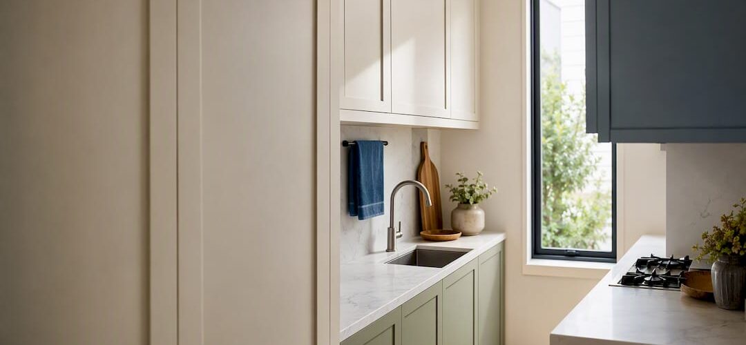
The safest bet for small kitchen cabinet colors is a light, warm white or soft greige on the majority of your cabinets, with a darker hue reserved for lowers or an island. Try samples like Benjamin Moore White Dove or Sherwin-Williams Alabaster before committing. Darker shades still work in a compact kitchen if you keep them below eye level and back them up with strong task lighting. The ten ideas below give you specific palettes to test in your own space.
TL;DR:
- Darker cabinet shades are suitable only when kept below eye level or paired with strong task lighting to prevent making the small space feel cramped.
- Matching cabinet undertones with countertops and flooring ensures harmony, especially when balancing warm and cool tones to avoid visual clashes.
- Testing larger paint swatches at different times of day provides a more accurate sense of how colors will appear under your kitchen’s specific lighting conditions.
- Refinishing cabinets with factory-like spray techniques preserves color and sheen longer than repainting with brushes, making it a cost-effective option for bold or trending hues.
- Light, reflective whites like White Dove or Alabaster remain the safest choice for enlarging small kitchens through higher light reflectance.
Table of Contents
- 10 Small Kitchen Cabinet Color Ideas Worth Testing
- How to Choose the Right Cabinet Color: A Quick Checklist
- Matching Cabinet Color to Countertops, Backsplash, and Flooring
- LRV and Lighting Rules That Change How Paint Reads
- Why Refinishing Beats Repainting for a Real Color Change
- The Psychology Behind Cabinet Color in a Small Kitchen
- Matte, Glossy, or Textured: How Finish Changes the Room
- Colorful Cabinets, Open Shelving, and Glass Doors
- Durable Paint Types That Hold Up in a Kitchen
- How Daylight and Bulbs Change the Same Color
- What Actually Matters When You Pick a Color
- Ready to Try a New Cabinet Color Without the Remodel Timeline
- Sources
- FAQ
10 Small Kitchen Cabinet Color Ideas Worth Testing
Picking cabinet colors for a small kitchen isn’t about avoiding color. It’s about knowing where color earns its keep and where it needs to step back. These ten approaches cover the range, from foolproof neutrals to bolder moves that still respect a tight footprint.
-
Light warm white. Benjamin Moore White Dove and Sherwin-Williams Alabaster are the two most requested cabinet whites for a reason. Both carry a warm undertone that keeps a small kitchen from feeling clinical, and both have a high enough light-reflectance value to visually expand a room. If your kitchen gets minimal daylight, this is where to start.
-
Soft greige or off-white. A shade like Edgecomb Gray or Accessible Beige splits the difference between warm and cool, which makes it forgiving when your countertop or backsplash has mixed undertones. Designers point to warm off-whites specifically because they reflect light while still coordinating with almost any material in the room.
-
Two-tone: white uppers, navy lowers. Pair a crisp white like Benjamin Moore Chantilly Lace on top with Sherwin-Williams Naval on the base cabinets. Keeping the ceiling and upper cabinets light preserves the sense of height and airiness, while the navy lowers ground the room. This two-tone move is one of the most repeatable strategies for adding depth to a small kitchen without shrinking the perceived volume.
-
Sage or gray-green. Sherwin-Williams Evergreen Fog has become one of the most requested cabinet colors of the past few years, and for good reason. It reads as calm and organic rather than trendy, and it pairs easily with warm wood floors or white oak counters.
-
Powder or dusty blue. A pale blue with a gray base feels coastal without leaning theme-park. Keep the backsplash white or a very light tile so the blue stays as the accent, not the dominant note.
-
Butter or pastel yellow. This one takes nerve, but a muted, dusty yellow rather than a bright one keeps it from overwhelming a small room. Balance it with neutral quartz or butcher block counters so the kitchen doesn’t feel like a single color statement.
-
Charcoal or soft black, island only. Farrow & Ball Railings is a deep, almost-black navy that works well as a single-piece statement. Confining it to an island keeps the rest of the room light and gives your eye one clear focal point instead of a wall of dark cabinetry.
-
Mushroom or putty midtones. A low-contrast, grayish-brown neutral lets cabinets and walls blend rather than compete. Designers recommend this exact move because limiting high-contrast breaks helps the eye glide across a room, which makes the kitchen read larger than its actual square footage.
-
Pastel accents on glass-front cabinets. If a full pastel kitchen feels risky, paint just one run of upper cabinets or swap in glass doors on a section, then paint the interior a soft mint or blush. It’s a small, reversible way to add personality.
-
Warm wood accents with painted frames. Leave a floating shelf or one cabinet run in stained wood while painting the rest. This mixed approach adds warmth without asking a whole extra color to do the work.
Pro Tip: Buy a quart, not a sample chip. Paint a two-foot-square board and prop it against your actual cabinets for 48 hours before you commit to a full order.
How to Choose the Right Cabinet Color: A Quick Checklist
Before you fall for a color online, run it against what’s already fixed in your kitchen.
- Start with what you can’t easily change. Countertop, backsplash, flooring, appliance finish, and hardware all have their own undertones, and the NKBA recommends evaluating every one of these before picking paint.
- Check your natural light. A kitchen with one small window needs a higher LRV color; a bright, south-facing kitchen has more room to experiment with mid-tones.
- Use the 60-30-10 rule. Sixty percent of the room (usually cabinets and walls) carries your dominant color, 30% goes to a secondary tone like an island or backsplash, and 10% is accent, like hardware or a light fixture.
- Test at both ends of the day. A color that looks perfect at noon can turn flat and cold under evening light.
- Decide light-all-over versus two-tone early, since it changes your countertop and hardware choices too.
Pro Tip: Testing a large swatch directly in the kitchen, and checking it morning and night, is still the single most reliable way to confirm a color choice before you commit to painting or refinishing the whole set.
Matching Cabinet Color to Countertops, Backsplash, and Flooring
Cabinet color rarely fails on its own. It fails when it clashes with everything around it. Start by identifying whether your countertop or backsplash leans warm (cream, beige, gold flecks) or cool (gray, blue-gray, white with gray veining), then choose a cabinet shade with a matching undertone.
- Warm stones, like a beige granite or warm-veined quartz, pair naturally with warm whites, greige, or muted greens.
- Cool stones and cool-toned tile pair better with crisp whites or blue-grays.
- Pick your hardware metal before your paint color. Brass pulls warm up a cool white; brushed nickel or matte black cools down a warm one.
- Warm wood flooring softens a stark white kitchen; cool gray LVP plank can make the same white feel sterile, so lean warmer on the cabinets to balance it.
- If your countertop is a busy, warm-veined quartz, choose Edgecomb Gray over White Dove. If your floor is cool gray LVP, choose Alabaster over a cream white. If your backsplash is navy tile, keep uppers white and skip navy lowers entirely to avoid doubling the dark tone.
For a deeper walkthrough on this, see how cabinet color coordinates with countertops and how to approach coordinating cabinet color with flooring.
LRV and Lighting Rules That Change How Paint Reads
LRV, or light-reflectance value, measures how much light a color bounces back into the room on a scale of roughly 0 (absolute black) to 100 (pure white). A higher LRV color makes a small kitchen feel more open, especially in rooms with limited natural light.
- High LRV: best for kitchens with one window or heavy shadow.
- Mid LRV: forgiving in most small kitchens with decent light.
- Low LRV: reserve for lowers or islands, and only with strong under-cabinet and ambient lighting layered in.
- Add task lighting under upper cabinets and a flush-mount fixture overhead if you’re going darker anywhere.
- Paint a two-foot swatch and check it at 8 a.m., noon, and 8 p.m. before buying gallons.
Why Refinishing Beats Repainting for a Real Color Change
Professional cabinet refinishing often uses factory-finish spray techniques rather than a brush and roller, which can result in a finish that holds its color and sheen longer. The process relies on careful sanding, primer, and multiple sprayed topcoats, the same layering approach cabinet manufacturers use before cabinets ever leave the factory.
A refinishing project can often be completed in a few days and cost significantly less than a full cabinet replacement.
That gap is exactly why refinishing makes sense if you’re testing a bolder direction, like navy lowers or a charcoal island, without gambling on a full remodel budget.
The Psychology Behind Cabinet Color in a Small Kitchen
Color changes how a room feels before it changes how it looks. Light, warm whites read as clean and calm, which is why they’re the default recommendation for anyone who wants a small kitchen to feel restful rather than cramped. Cool blues and soft grays have a similar effect but add a touch of formality, which works well if your kitchen opens into a dining or living area.
Deeper colors carry more psychological weight, literally. A wall of dark cabinets can feel like it’s closing in, but the same color on an island alone reads as intentional, almost like furniture, rather than a wall pressing inward. That’s the entire logic behind treating a navy or charcoal island as a focal point instead of a full palette.
Greens sit in an interesting middle ground. Sage and gray-green tones like Evergreen Fog feel grounding rather than aggressive, likely because green is the color most associated with the outdoors, so it doesn’t trigger the same “this room is small” response that a saturated color might. Yellow, when muted, tends to read as cheerful without demanding attention, which is why it works better as a soft butter tone than a bright, saturated hue in a tight space.
The takeaway: color affects mood, but placement affects perceived size. Use color for feeling, and use restraint for space.
Matte, Glossy, or Textured: How Finish Changes the Room
Cabinet color gets most of the attention, but finish is doing quiet work in the background. A matte or eggshell finish diffuses light and hides small imperfections, which makes it a forgiving choice for busy families, but it can also make a small kitchen feel slightly flatter since it absorbs more light than it reflects.
A satin or semi-gloss finish bounces light around the room, which amplifies whatever benefit your LRV choice is already giving you. This is why most professional refinishers lean toward satin or semi-gloss on kitchen cabinets specifically, not just for durability but because it makes a light color read even brighter and a dark color still feel crisp rather than heavy.
Textured finishes, like a light hand-brushed look, add character but can visually shrink a room if overused, since texture reads as detail and detail draws the eye to a surface rather than past it. In a small kitchen, save texture for one element, an island or a single accent wall of cabinetry, rather than spreading it across every door front.
Colorful Cabinets, Open Shelving, and Glass Doors
Full color commitment isn’t the only way to bring in a bold shade. Open shelving lets you introduce color in small doses, painting the shelf backing or the interior of a single upper cabinet a saturated color while keeping the surrounding cabinetry neutral. It’s a low-risk way to test a color you’re not ready to commit to on every door.
Glass-front cabinet doors do something similar in reverse. Instead of hiding color inside a closed cabinet, they put your dishware or glassware on display, which adds visual interest without adding another painted surface to the room. Pair glass doors with a soft interior color, a dusty blue or blush, and you get depth without the commitment of painting every door in the kitchen that same shade.
Both techniques work because they break up a solid wall of cabinetry, which matters more in a small kitchen than a large one. A single color used everywhere can feel monotonous in under 150 square feet in a way it wouldn’t in an open-concept great room.
Durable Paint Types That Hold Up in a Kitchen
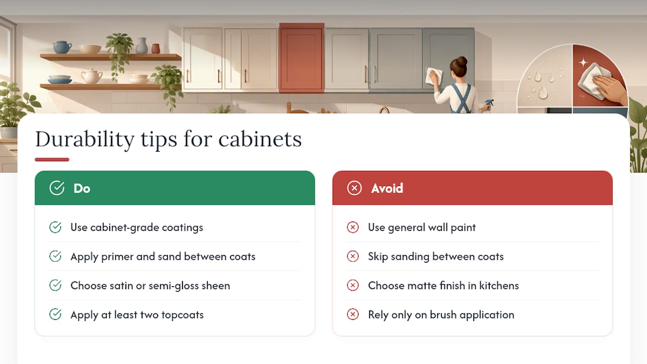
Standard wall paint isn’t built for the abuse a kitchen cabinet takes daily: grease, moisture, constant hand contact, and the occasional slammed door. Professionals typically recommend a cabinet-grade coating, like a conversion varnish or a dedicated cabinet enamel, applied over a proper primer and sanded between coats. These finishes cure harder than wall paint and resist scuffing and moisture far better over time.
Sheen matters here too. Satin and semi-gloss both clean up easier than matte, since a slicker surface sheds grease and fingerprints instead of absorbing them. If you’re refinishing cabinets yourself, look for products labeled specifically for cabinetry or trim, not general-purpose interior wall paint, and expect to apply at least two topcoats for real durability.
This is also where professional spray application earns its cost. A sprayed finish lays down thinner, more even coats than a brush or roller, which reduces the drips and brush marks that trap grime over time. For a family kitchen that sees daily use, that durability difference shows up within the first year, not the tenth.
How Daylight and Bulbs Change the Same Color
The exact same can of paint can look like three different colors depending on when you look at it. Morning light, especially north-facing light, tends to be cooler and can make a warm white look slightly gray. Afternoon sun, particularly from a west-facing window, warms everything up and can push a greige into beige territory.
Artificial lighting adds another layer. Warm LED bulbs (around 2700K to 3000K) enhance warm undertones in whites and greiges, while cooler LEDs (4000K and up) can make the same color look sterile or slightly blue. This is exactly why testing a swatch only under store lighting or only in daylight leads to disappointment once the cabinets are installed and living under your kitchen’s actual bulbs.
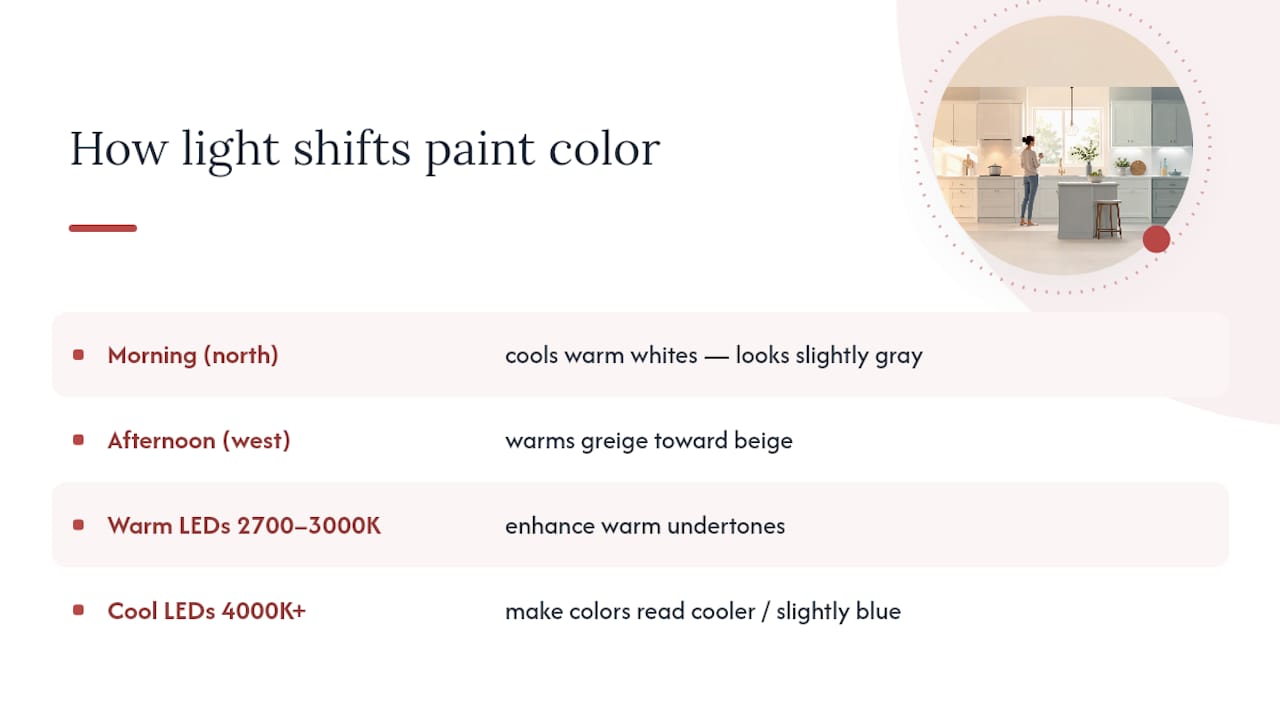
If your small kitchen relies mostly on overhead fixtures with minimal natural light, lean toward warmer bulb temperatures to keep whites and neutrals from reading cold. If you get strong afternoon sun, a slightly cooler white can balance out that warmth rather than compound it.
What Actually Matters When You Pick a Color
Most advice on small kitchen cabinet colors treats the decision like a personality quiz: are you a “moody navy” person or a “bright white” person? That framing misses the real variable, which is light. A gorgeous navy in a magazine photo shoot with three skylights will look muddy and heavy in a kitchen with one north-facing window and a single overhead fixture.
The conventional advice to “just go light in a small space” isn’t wrong, but it’s incomplete. It skips the fact that a well-lit dark island can outperform a poorly lit light kitchen in terms of how the room actually feels day to day. Lighting and LRV deserve equal billing with the color chip itself, not a footnote after the decision is made.
If you take one thing from this, prioritize testing over trusting a paint chip. A two-foot swatch checked at three different times of day will tell you more than any showroom display or online photo ever will, and it costs a fraction of what a wrong decision costs once the whole kitchen is painted.
— Jesse
Ready to Try a New Cabinet Color Without the Remodel Timeline
Testing a swatch is one thing. Living with a full repaint that chips within a year is another. Factory-finish spray coatings using a multilayer process similar to that used by cabinet manufacturers help cabinet colors keep their color and sheen for years at a fraction of full replacement cost.
If you’re leaning toward a two-tone kitchen or a darker island, a color consultation is the easiest way to see it applied to your actual cabinet boxes before committing. Browse the cabinet color selection guide for more palette direction, then call or text 720-219-9716 to book a consultation, or start directly with the cabinet refinishing Denver service page to get a project quote.
Sources
- How to Choose Colors for Kitchen Cabinets – The Decor Mag
- 6 Paint Colors That Make Small Kitchens Look Instantly Larger, Designers Say – The Spruce
- 13 Color Schemes to Give Your Small Kitchen Big Style – Better Homes & Gardens
- NKBA (National Kitchen & Bath Association)
FAQ
What is the best cabinet color for a small kitchen?
A light, warm white like Benjamin Moore White Dove or Sherwin-Williams Alabaster is the safest choice, since both have a high LRV that reflects light and makes a small kitchen feel larger.
What colors make a small kitchen look bigger?
Warm off-whites, dusty green-grays, and light-to-mid blues all read as larger because of their higher light-reflectance values, and keeping the palette to two or three colors total helps the whole room feel cohesive rather than cramped.
What color units are best for a small kitchen?
Light neutrals work best for the majority of cabinets, but a two-tone approach, with white uppers and a deeper lower cabinet color like Sherwin-Williams Naval, adds depth without sacrificing the airy feel of the room.
How do you make a small kitchen look classy?
Stick to two or three coordinated colors, match your cabinet undertone to your countertop and hardware finish, and choose a satin or semi-gloss sheen so the surfaces catch light rather than absorb it. A professionally sprayed factory finish can give cabinets an even, high-end sheen that is difficult to achieve with a DIY brush job.