
Cabinet color is the single most powerful design variable controlling the emotional atmosphere of your kitchen. The moment you walk into a kitchen, your brain processes the dominant color of the cabinetry before registering countertops, flooring, or appliances.
Cabinet Painting Service Areas in Denver & Surrounding Cities, Cabinet Refinishing in Denverc County,
Serving Lakewood, CO, Littleton, CO, Golden, CO, Evergreen CO, Roxborough Park CO, Ken Carl Ranch CO,
Arvada, CO, Wheat Ridge, CO,
and Parker CO. Castle Pines CO. Englewood CO. Centennial CO.
Cabinet Painting in Arapahoe County, CO
Including Centennial, CO, Greenwood Village, CO,
Cherry Hills Village, CO, Englewood, CO,
and Aurora, CO.
Cabinet Painting in Adams County & Broomfield, CO
2026 study by Better Homes and Gardens Real Estate confirms that cabinet colors are processed first in kitchen evaluation, directly shaping emotional connection and perceived home value. Understanding color psychology in kitchens is not a decorating luxury. It is a practical tool for designing a space that supports how you actually live, cook, and feel every day.
How cabinet color affects kitchen mood: the psychology behind the choice
Color psychology is the study of how specific hues trigger predictable emotional and physiological responses. In kitchen design, this science translates directly into how energized, calm, or focused you feel while preparing meals or gathering with family. Cabinet colors drive emotional comfort and resale appeal simultaneously, influencing buyer perceptions of cleanliness, order, and lifestyle suitability. That dual function makes cabinet color one of the highest-return decisions in any kitchen renovation.
The impact of cabinet color operates on two levels. The first is immediate and instinctive. Warm hues like terracotta or golden yellow trigger a physical sense of warmth and appetite within seconds. The second level is cumulative. Living with a color daily shapes your baseline mood in that space over weeks and months. Choosing a color that photographs beautifully but feels wrong in daily life is a costly mistake that Cabinetsrefinishing sees homeowners make repeatedly.
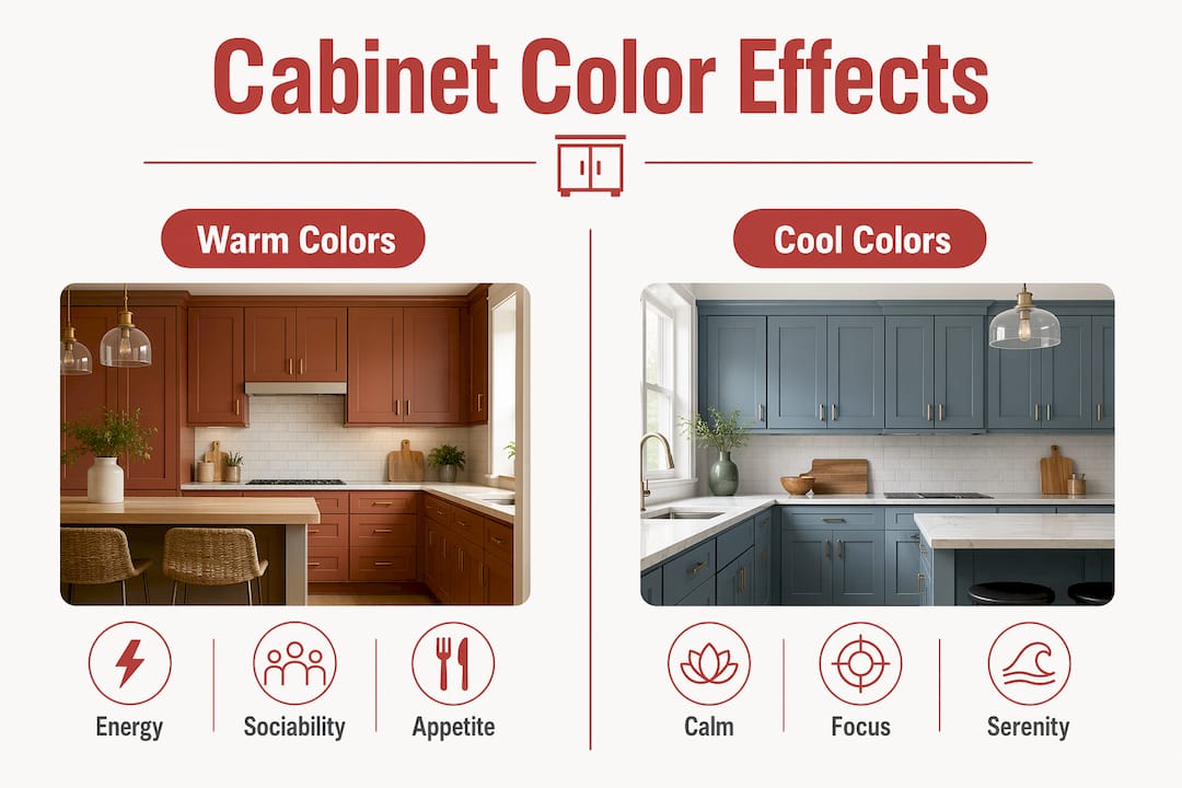
How do warm cabinet colors affect kitchen mood and energy?
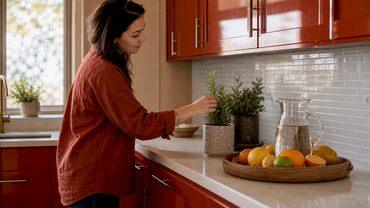
Warm tones like yellow, red, and orange energize the kitchen environment and stimulate social interaction and appetite. This makes them ideal for family kitchens that double as gathering spaces, open-plan layouts where the kitchen anchors entertaining, and homes where breakfast and dinner are communal rituals. The physiological response is real. Warm colors increase heart rate slightly and stimulate the production of appetite-related hormones, which is why so many restaurant brands use red and orange in their branding.
The best warm cabinet shades for mood include:
- Butter yellow (Benjamin Moore Hawthorne Yellow): Cheerful and light without being aggressive; works well in kitchens with moderate natural light
- Terracotta orange (Sherwin-Williams Cavern Clay): Earthy and grounding; pairs naturally with wood countertops and stone tile
- Sage-adjacent warm green (Farrow and Ball Mole’s Breath): Bridges warm and cool; adds energy without overstimulation
- Deep brick red (Benjamin Moore Moroccan Red): Bold and sophisticated; best used on lower cabinets or an island to avoid visual fatigue
The downside of warm tones is real and worth naming directly. Saturated reds and oranges on full-height cabinetry in a small kitchen create visual overstimulation that becomes exhausting after a few weeks. The fix is restraint. Use warm colors on a single cabinet run or island, then balance with white or cream on the remaining cabinetry.
Pro Tip: If you love warm tones but worry about commitment, apply them to your lower cabinets only and pair with white or off-white uppers. Cabinetsrefinishing’s two-tone cabinet approach gives you the energy of warm color without the visual weight of a fully saturated kitchen.
What mood do cool and neutral cabinet colors create in kitchens?
Cool tones like blue, green, and gray promote calmness, balance, and serenity in kitchen spaces. Neutral tones, including white, beige, and natural wood, are associated with cleanliness and spaciousness, creating a restful ambiance that supports focused cooking and quiet morning routines. If your kitchen is where you decompress after work rather than where you host parties, cool and neutral cabinet colors are your strongest allies.
Here is how specific cool and neutral shades map to mood outcomes:
- Soft white (Sherwin-Williams Alabaster): Signals cleanliness and order; makes small kitchens feel significantly larger; the top choice for resale value
- Pale blue-gray (Benjamin Moore Pale Smoke): Evokes calm without feeling cold; works exceptionally well in north-facing kitchens with warm artificial lighting
- Sage green (Farrow and Ball Mizzle): Connects the kitchen to nature; reduces visual stress; popular in wellness-focused home designs
- Warm gray (Sherwin-Williams Agreeable Gray): The most versatile neutral in kitchen design; reads warm in natural light and cool under LEDs, making it adaptable across seasons
- Natural wood tone (unstained oak or walnut): Adds organic warmth without color commitment; pairs with any accent color and ages gracefully
Cool and neutral tones also support different kitchen functions more effectively than warm tones. A pale blue-gray kitchen feels like a productive workspace in the morning and a calm retreat in the evening. That functional flexibility is why gray cabinet colors have dominated kitchen design for over a decade.
Pro Tip: Gray is not one color. It shifts dramatically based on undertones and light direction. Before committing, read Cabinetsrefinishing’s guide to painting cabinets gray to understand how to select the right gray for your specific kitchen conditions.
How do cabinet finishes and lighting change color perception?
Lighting and cabinet finish significantly alter the visual perception and mood impact of any cabinet color. A matte finish absorbs light and makes colors appear deeper and more saturated. A high-gloss or lacquer finish reflects light and makes the same color appear lighter, brighter, and more expansive. This means two kitchens painted in identical shades can feel completely different based solely on finish choice.
Here is a direct comparison of finish types and their mood effects:
| Finish type | Mood effect | Best use case |
|---|---|---|
| Matte | Warm, intimate, sophisticated | Larger kitchens with ample natural light |
| Satin | Balanced, clean, versatile | Most kitchens; easiest to maintain |
| Semi-gloss | Bright, energetic, reflective | Small kitchens needing visual expansion |
| High-gloss | Bold, dramatic, modern | Statement islands or accent cabinets |
Lighting direction compounds these effects significantly. North-facing kitchens receive cool, bluish light that makes warm tones appear flat and cool tones look clinical. South-facing kitchens flood with warm golden light that makes cool grays and blues feel inviting rather than cold. This is not a minor consideration. It is the reason a cabinet color that looked perfect in a showroom can feel wrong in your actual kitchen.
Key factors to evaluate before finalizing any cabinet color:
- View paint samples on the actual cabinet surface, not on a white card held up to the wall
- Observe the sample at three distinct times: early morning, midday, and evening under artificial light
- Test samples in natural and artificial light at different times of day to accurately assess final appearance
- Account for the color of your countertops and backsplash, which reflect color onto cabinet surfaces
Dark cabinet colors like black and navy add sophistication but absorb light and show dust more easily. Thoughtful layered lighting, including under-cabinet LEDs and pendant fixtures, is non-negotiable when working with dark cabinetry. For a detailed look at navy specifically, Cabinetsrefinishing’s navy cabinet guide covers the lighting and maintenance requirements in full.
What role does cabinet color play in daily comfort and mental clarity?
Color acts as a silent conversation with the nervous system, signaling energy or calmness depending on hue and context. Bright yellows cue wakefulness and alertness. Soft blues signal relaxation and lower cognitive arousal. This is not metaphorical. The nervous system responds to color input before conscious thought processes it, which means your cabinet color is influencing your stress levels and focus every time you enter the kitchen.
Organized cabinetry with thoughtfully chosen color supports mental clarity and positive mood. Smart storage combined with the right color reduces visual clutter, which directly lowers cortisol levels associated with environmental stress. A kitchen with pale sage green cabinets and well-organized interiors feels categorically different from the same layout in a chaotic warm red, even if the physical organization is identical. The color primes your expectation of the space before you open a single drawer.
Personalized color choices also create emotional ownership of the kitchen. Homeowners who select colors that reflect their actual personality and lifestyle, rather than following trend forecasts, report higher satisfaction with their kitchens over time. A family with young children and a love of outdoor cooking will feel more at home in a warm, earthy kitchen than in a minimalist white one, regardless of what design publications recommend.
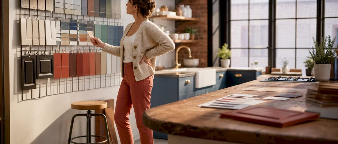
Pro Tip: Build a physical or digital mood board that includes your cabinet color alongside countertop samples, flooring, and hardware finishes before committing. Visualizing all elements together prevents costly conflicts between warm and cool tones that look fine in isolation but clash in context.
How to choose the right cabinet color for your kitchen mood
The 60-30-10 color rule is the most reliable framework for creating a balanced kitchen color scheme. Cabinetry functions as the dominant 60% color, walls and countertops as the secondary 30%, and hardware and accessories as the accent 10%. This ratio prevents finish overload and creates the visual harmony that makes a kitchen feel intentional rather than assembled.
Follow this sequence when selecting your cabinet color:
- Define your mood goal first. Write down three words describing how you want to feel in your kitchen. Energized, calm, and creative are common answers. Your color choice should map directly to those words before you look at a single paint chip.
- Assess your light conditions. Measure which direction your primary windows face and note whether your artificial lighting is warm (2700K-3000K) or cool (4000K-5000K). This determines whether warm or cool tones will read as intended.
- Consider kitchen size and ceiling height. Lighter colors expand perceived space. Darker colors contract it. A small galley kitchen with 8-foot ceilings and dark navy cabinets will feel oppressive regardless of how sophisticated the color is in a larger space.
- Factor in maintenance reality. White and very light cabinets show grease and fingerprints more readily than mid-tone colors. Dark cabinets show dust and water spots. Mid-tone warm grays and sage greens offer the best balance of mood impact and practical maintenance.
- Test before committing. Apply a large sample directly to your actual cabinet surface and live with it for at least five days across different lighting conditions and times of day.
A professional cabinet painting color consultation removes the guesswork from this process entirely, matching your mood goals to specific colors and finishes that will perform well in your actual kitchen conditions.
Key takeaways
Cabinet color is the primary design lever for controlling kitchen mood, and selecting it without accounting for light, finish, and lifestyle leads to expensive regret.
| Point | Details |
|---|---|
| Warm colors energize | Yellows, oranges, and reds stimulate appetite and social interaction but require restraint to avoid fatigue. |
| Cool tones calm | Blues, grays, and sage greens promote focus and relaxation, ideal for kitchens used as daily retreats. |
| Finish changes everything | Matte deepens color and adds intimacy; high-gloss reflects light and expands perceived space. |
| Light direction is decisive | North-facing kitchens need warm tones or warm artificial lighting to prevent cool colors from reading as cold. |
| Test before committing | Apply samples directly to cabinet surfaces and observe across morning, midday, and evening light conditions. |
Color trends look great in photos. Your kitchen is not a photo.
I have watched homeowners fall in love with a cabinet color on Instagram and commit to it without ever seeing it in their own kitchen light. The result is almost always disappointment. A deep forest green that looks moody and sophisticated in a Brooklyn loft with 12-foot ceilings and south-facing skylights will feel oppressive in a 200-square-foot Denver kitchen with one north-facing window. The color is not wrong. The context is wrong.
The insight that changes how most people approach this decision is simple: your emotional response to a color in your own kitchen is the only data point that matters. Not the trend report. Not the before-and-after photo. Not what your neighbor chose. I have seen homeowners achieve genuinely transformative results by choosing colors that design publications would never feature, because those colors matched their actual lives.
The other thing worth saying directly is that the best cabinet colors for mood are not always the most dramatic ones. A warm white with a satin finish, well-lit and paired with natural wood hardware, creates more daily emotional satisfaction than a bold color chosen for visual impact. Subtlety compounds over time. Drama fades.
If you are unsure, start with the sheen level before the color. Getting the finish right changes how every color performs, and it is a decision most homeowners skip entirely.
— Jesse
Transform your kitchen mood with professional cabinet refinishing
Choosing the right cabinet color is half the work. Executing it with a finish that holds up to daily kitchen use is the other half. Cabinetsrefinishing delivers a factory-quality finish using a multi-layer preparation and coating process that DIY painting cannot replicate. Projects complete in 3 to 5 days, and the cost ranges from $3,000 to $8,000, compared to $15,000 to $40,000 for full cabinet replacement. If you are ready to change how your kitchen feels, the cabinet refinishing process Cabinetsrefinishing uses ensures your chosen color performs exactly as intended, in your light, with your lifestyle. For homeowners working with a designer, the high-end refinishing guide covers the full scope of what professional results look like.
FAQ
How does cabinet color affect kitchen mood directly?
Cabinet color triggers immediate emotional and physiological responses before conscious thought processes the space. Warm tones stimulate energy and appetite while cool tones promote calm and focus, making color the fastest way to shift how a kitchen feels.
What are the best cabinet colors for a calming kitchen mood?
Soft blues, sage greens, warm grays, and natural wood tones consistently produce the calmest kitchen environments. These colors lower visual stimulation and signal order and cleanliness, which reduces stress during daily kitchen use.
Does cabinet finish affect mood as much as color?
Yes. A matte finish makes any color feel deeper and more intimate, while a high-gloss finish makes the same color feel brighter and more expansive. Choosing the wrong finish can undermine even a well-chosen color.
Can dark cabinet colors negatively affect kitchen mood?
Dark cabinets like black and navy absorb light and show dust more readily, which can create a heavy or gloomy atmosphere without proper layered lighting. Under-cabinet LEDs and pendant fixtures are non-negotiable with dark cabinetry.
How do I test a cabinet color before committing?
Apply a large paint sample directly to your actual cabinet surface and observe it at three times of day: early morning, midday, and evening under artificial light. This reveals how the color shifts across your kitchen’s specific light conditions before you commit.
Recommended
- Cabinet Painting Color Consultation: Choosing the Perfect Finish for Your Denver Home – Cabinet Refinishing and Cabinet Painting Denver 720-219-9716
- Painting Kitchen Cabinets Gray: The Professional Guide for Denver Homeowners – Cabinet Refinishing and Cabinet Painting Denver 720-219-9716
- Painting Kitchen Cabinets Navy Blue: The Denver Homeowner’s Guide to a High-End Finish – Cabinet Refinishing and Cabinet Painting Denver 720-219-9716
- The Best Sheen for Kitchen Cabinet Paint: A Professional Denver Guide – Cabinet Refinishing and Cabinet Painting Denver 720-219-9716